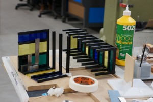
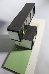
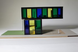
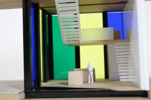
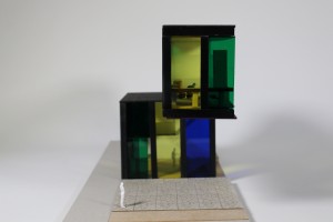
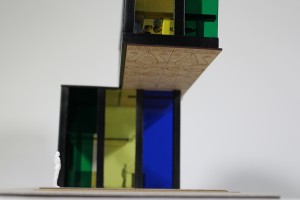
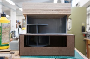
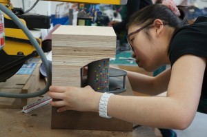
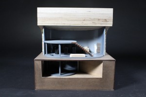
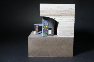
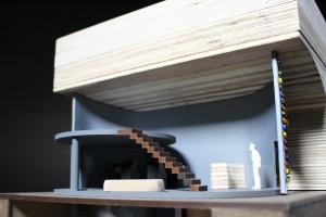
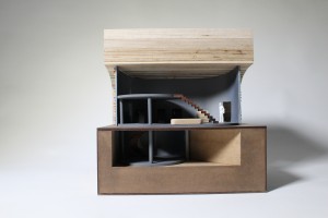
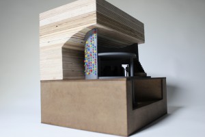
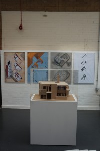
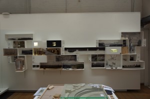
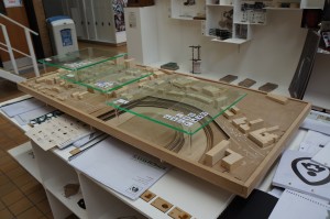
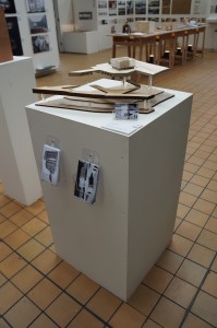
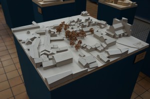
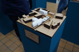
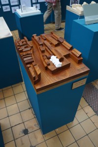
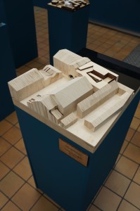
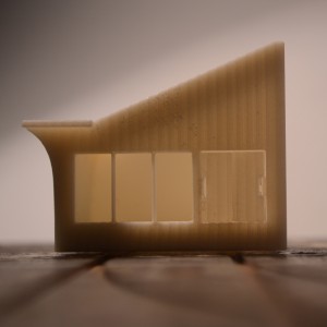
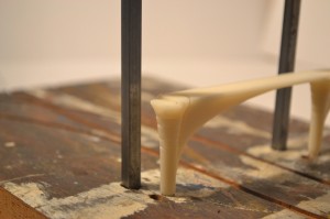
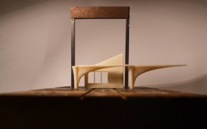
‘Peacock Museum’ 1:50 Cross Section Model by Mahishini Vasudevn

DSC04037

In another First Year case study we asked Mahishini Vasudevn to tell us about her recently completed project for the ‘Resolution’ brief:

“For our first project, habitat, I chose Peacock as my animal client so I made a design that would stand proudly and attract the eyes of the people just like the Peacock would do. To portray this, my design had a cantilevered floor which protrudes over the pavement of my site in Charles Street. The facade was designed to have stained glass which had the same colours as the peacock. In my design I have mainly focused on grasping the attention of people instantaneously.

In order to convey the most information about my design, I made a sectional model to give an insight to the structural aspects and the interior detailing of the design like the cantilevered stairs and the circulation around the building.

DSC04091

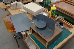
In the case of materials, for the glass facade I have used coloured acrylic as it best represents the colour and transparency that is implied in my design.  As for the columns, beams and floor joists I used Styrene H-columns which were sprayed in black to represent steel frames. The floors were made with MDF wood to replicate the wooden floors. The pathway with granite paving slabs was laser engraved on grey card to show the colour and the small amount of texture that I wanted to show. The interior was done with wood and acrylic. In my model I have tried my best to produce them in such a way that they almost represent the same materials that would be used in reality if it were to be built.

DSC04135

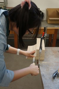
Through making this model I have learnt new techniques of model making. It has taught me more about my design like the structural connections and how a design comes together as I was able to have a 3D view of my design. I’ve learnt how to plan my work and handle time with care.

Model making has been the best experience I’ve had as a first year architecture student and I’ve enjoyed working in the workshop.”
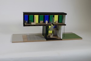
IMG_8084 This model is put together with a good selection of materials that help to demonstrate the different component of the design shown in section. Mahishini made good use of pre existing strip materials by choosing styrene H beams to construct what would be the steel frame of her building if made at 1:1. Strip materials such as these are extremely useful in section modelling and we hope to stock a range in the near future. In the mean time they are available from 4D Modelshop where you can also register for a student discount quoting either myself or Jim as your tutor here at Manchester.

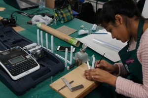
IMG_8152 IMG_8244

IMG_8088 IMG_8248 IMG_8250

‘Arch Game Lab’ 1:50 Cross Section Model by Estelle Xin Yun Ang

DSC04032

First Year Student Estelle Xin Yun Ang has just completed a 1:50 section model of her proposal for the re-purpose of vacant space under a railway arch way. Estelle kindly described her project for us:

“I chose to build a model in which part of the facade was removed to communicate the details of interior spaces and the assembly of structural components. The railway arch was modelled as a section to show how it acts as the ceiling of my design. I modelled the underground and made a window to give a good view into the basement. The facade detail was quite important in order for me to express the sense of gaming, which was why I took the time to paint the tiny offcuts.

DSC04082

The exterior spaces surrounding my design is extensively graffitied which inspired me to design a gaming studio where the potential of play is explored. I incorporated game buttons into the design of the facade to convey my idea of gaming.

DSC04092

To model the context, I decided to use plywood as the texture provides a good representation of the brickwork for the archway. For the ground/base, I used mdf wood and applied wood stain to give a good contrast to the light coloured arch. I spray painted the laser cut mdf in grey to show the concrete floor plates. For the walls I chose to use vac-formed styrene to achieve a permanent curved shape. I added strips of acrylic between the two pieces of styrene to make up the thickness of the wall and that helped save some material.

DSC04120 DSC04139


I overcame the difficulties of modelling the curved shape of my design and I have learned to use different techniques on different materials to achieve the best result. After a few trials and errors I was able to understand the construction of my design. This is what I find interesting because there are so many ways in making a model and through experimentation I get to know which method works best for my design.”

IMG_8220 IMG_8226 IMG_8228

What is clearly shown in this model is the attention to making each element correct for assembly. This patience and consideration is something we should all aspire to when designing and making. Often one of the hardest things to do during a project is accept that something you have made is incorrect and should therefore be re-made. Whilst this may seem like wasted time it is exactly the opposite and by taking a step back from the project to look at what you have learned you will see that such mistakes are necessary for your own understanding of the design as well as gaining a better understanding of material and machine constraints when making.

We hope to see more projects with this level of thought and consideration in the coming weeks leading up to the final submissions and in future first years.

IMG_8259 IMG_8262

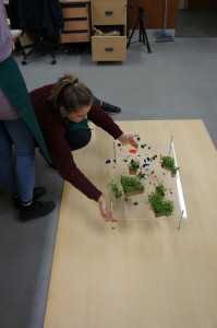
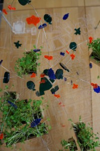
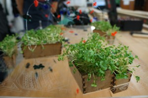
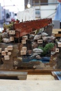
Urban Food Flow Model, Sophie Smith

To demonstrate her ideas for rebalancing food slow or supplies in the city Sophie used an unorthodox approach to demonstrate her proposal. Using wire to convey possible food output areas of the site are highlighted using coloured acrylic and linked. The main focus is around an existing supermarket with the intention being to show how redistribution of suppliers could be increased locally.Living water cress troff’s are used in places of significant produce making this a living model – fairly unusual but interesting approach!

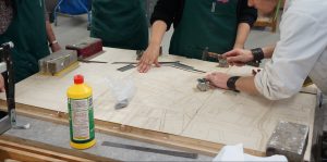
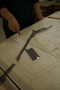
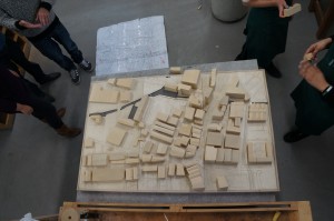
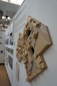
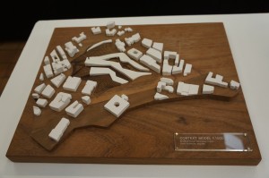
1:500 Master Plan Model, Year 3 BA Architecture

This group project for 3rd year BA students will be used to display multiple concepts that will continue to develop throughout the year. For this reason considerable thought was put into getting the contouring and overall model size correct for purpose.

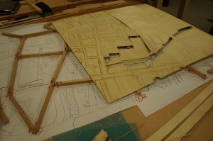
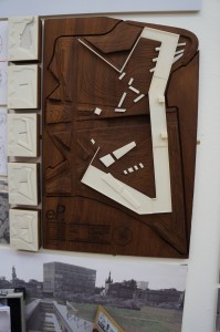
By figuring out high and low points on their site the group could then make a series of supporting ‘ribs’ at the relevant size for the 1:500 scale. Clearly marking each piece by number is crucial when there are many components. Once fixed in place the engraved ‘skin’ was fixed over the top creating the flow of contours across the site.


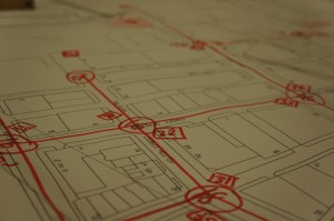
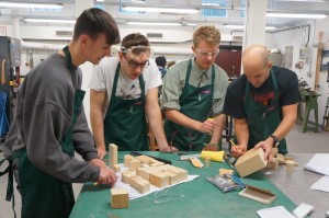
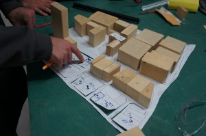
The next main phase of construction was to produce the existing site buildings. by taking plans printed at scale the group divided the site into different zones and gave each building a number to assure easy identification when assembling.

By referring to visual reference such as photographs it is possible to find an approximate building height by looking at courses of brickwork and door/window heights. At this scale approximations are fine for the models purpose but extra care should be taken when focussing on areas in the immediate vicinity of the areas being used for proposed development.

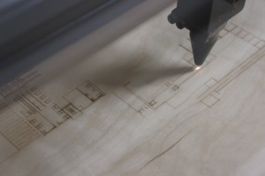
The group decided to add extra laser engraved facade details to the exiting buildings closes to their proposed site. This helps to highlight the concentration and detail in the surrounding buildings without over emphasising their physical construction.

As the group found out, adding too many detail lines can prove costly in terms of time on the laser cutter.
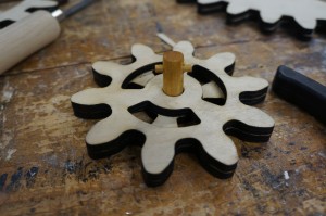
We encourage you to consult us about any of these fine details as more often than not they can be simplified and still easily convey the message.

Kinetic Sculptures

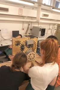
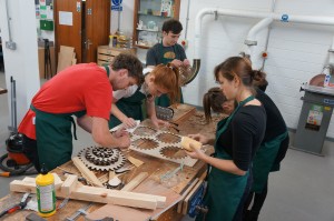
Over the last two weeks groups of 3rd year students have been in the workshop producing work under the brief ‘kinetic sculpture’. This broad brief allows them to interpret the idea of movement in construction and helps to prepare them for later units which will ask them to explore adaptable buildings – highly likely to feature moving components.

We will post more on this unit as it develops!

Welcome back to ‘SEED’ and a new academic year!

As some of you may have noticed we have added an extra ‘E’ to our name due to the merge with the School of Education. Our full name is now the School of Environment, Education and Development or SEED.

Busy summer

Over the summer we have been busy co-writing a second edition to the highly acclaimed book ‘Architectural Modelmaking’ by Nick Dunn. We expect the book to be published sometime next year and should prove very useful for existing and new students of architecture. We’ll post more on this when we can!

This had kept us productive along with a materials re-stock and clear out in preparation for your return. We hope to stock some new acrylic thicknesses in the next few weeks. Up to date materials price lists are now up in the workshop and can also be checked here on the blog.

Up-front payment for laser cutting

From now on we will only be allowing students to book laser cutting slots if they have paid. This change is being implemented to reduce the number of no-shows that occurs during busy periods which led to many hours cutting time being wasted last term.

New Full-Time Workshop Technician 

The workshop now has an additional member of staff as Scott Miller has now been made a full-time member of the technical team. Some of you may have met Scott last year when he worked with us on a casual basis. Scott is a very accomplished model maker and will be happy to help with any of your model making requirements.

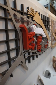
Subvert Skate Park, Saskia Furman

This site is currently a car park in Manchester’s Northern Quarter. Saskia’s 3rd year proposal for this site is a new development providing a space for the ‘socially un-welcome’. The development would include a skate park, hostel and other spaces for urban sports.
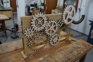
For this project Saskia used different coloured acrylics to represent different sections of her proposal.

This type of model is sometimes known as a ‘Jewel model’ due to the illuminated effect given by the coloured acrylics. Commercially this type of model get’s varied use.

Architects Rogers Stirk Harbour & Partners favour this style of model during their design development stages.  Providing the CAD files are set up and drawn correctly this type of model can be a great quick addition to a project, this example took around 5 hours to draw, cut and assemble incuding some trial and error!

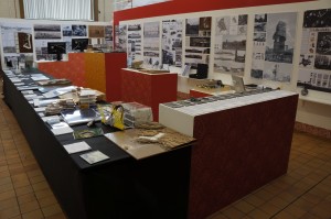
‘We Are All Explorers’ End of Year Show 2013

 It’s been a couple of weeks since our last update - with good reason!

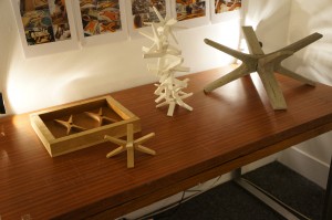
With all systems go for the end of year show things have been very busy in the workshop with final model’s being finished, wall units and display plinths being made. As well as these student tasks we had our own projects to complete for the show.

The opening successful and the exhibition days over, we can be certain all efforts paid off.

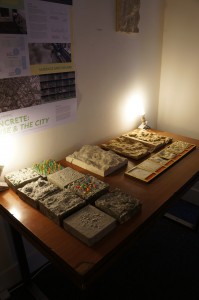
Here are some photographs of the completed works on display. More case studies will follow soon! For more information about the ‘We Are All Explorers’ exhibition click here.

DSC00512

Mayfield Redevelopment, Joseph Hamblin

Josephs description of his project:

My initial place/non-place study of mayfield highlighted the temporality of these ideas. To me mayfield was an area made up of and defined by working relationships, it is fragmented from its urban context and the activities on site work around one another rather than with one another. I wanted to create a unifying vision which responded to the existing urban condition and tied the fragmented territory together. My project brings ideas of knowledge exchange and open source information together to create a platform for innovation on both a personal and corporate scale.
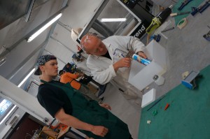
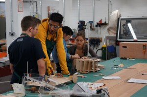
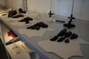
It seemed very fitting for Joseph to use 3D printing to convey his ideas in his model. The idea behind his site redevelopment was that individual business units can be extended or reduced by simply adding or removing sections. New units would be created on site and moved into place using a rail system.

3D printing also lent itself to the mechanical side of the design, allowing moving components such as wheels and the rotating walkways.

In keeping with the new meets old theme on Joseph’s site he decided to keep the reclaimed piece of teak ‘as was’ with its scratched paint and chipped surface. This works really well in creating contrast and makes for a really nice object aside from its relevance to the design concept.

Joseph Hamblin.jpg 3 All Photographs shown here are taken from Joseph’s web page. Click here to see more.

Ancoats Community Development ‘Hybrid Scheme’, Sandra Schenavsky

3rd year Student Sandra Schenavsky decided to take a materialistic approach to her final submission model. The proposed site in Ancoats would feature a well rounded use of buildings to create a ‘Work, Life and Leisure’ balance for those who might use the space.

Sandra wanted to convey the different uses of each element of her design by representing them as near to her proposed material finish as possible. To do this the existing site and landscaping was represented in laser cut card contours. The main building itself was constructed using pigmented plaster casts to represent concrete sections, laser cut MDF to represent wooden cladding and laser cut acrylic to represent glass facades.

This was a great experimentation project which found a good balance of techniques. Casting plaster into MDF molds proved challenging but after several trials Sandra was able to come up with an effective way of casting the forms she wanted.