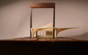
Pangaea Stage Set for Manchester Academy by Peter Lee

Towards the end of the first semester 5th Year Student Peter Lee was approached by The University of Manchester to design and make a large scale set piece for the student run festival, Pangaea. The event was held at the Manchester Academy and runs across many venues in Manchester. Pete described the project for us:
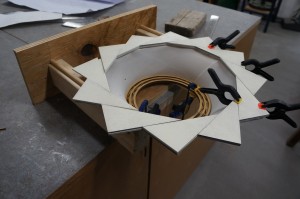
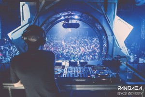
 ‘The event’s theme was ‘Space Odyssey’ so designed a ‘wormhole’ with an elevated DJ booth as a focal point in the centre. Throughout the project I was working closely with Academy staff as the design had to both be both the right size for the room and mountable on the existing lighting rigs on the stage. 
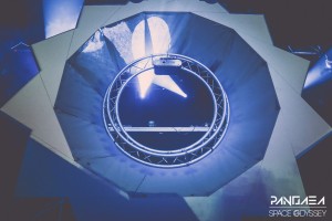
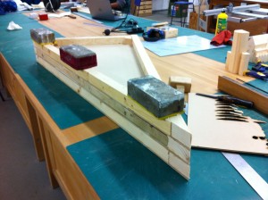
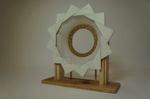
For ease of fabrication decided to use 12 identical interlocking triangle frames to create a portal, which sits in front of an aluminium circle truss with fabric panels to give the appearance of depth. The design was also created in coordination with a projectionist, who required a scale model for testing visuals on. By mocking up the design physically at 1:10 it gave me a really good idea of the structural issues faced by hanging a 4m wooden portal and helped me to design a bracing system’

Pete Lee (2)The model was made using components that would eventually come to life as large scale versions looking virtually identical. A wooden frame was used to support a focal hub and fabric was then stretched to the back of the segmented aperture-like ring at the front of the piece.Pete Lee (5)Once the design has received approval for full size production Peter went about turning the concept model into a full scale design. The triangular sections were each cut out using the larger CNC cutter at MMU before being transported across to B.15 for additional pieces to be added.
Peter describes his reasoning for using CNC cut components for the full scale prop:

‘For the 1:1 build I found the CNC machine a really useful tool as it would have been nearly impossible to replicate twelve identical panels by hand – absolute precision was really important throughout the process as the projection maps only had a few cm tolerance for error. Although the digital methods I used were really basic (Sketchup) it was incredibly useful for working out the angles for the panel structure. 
Another really important part of the project was getting logistics spot on – was quite limited for time due to university commitments so efficient use of workshop time was crucial and greatly aided by digital design tools. The panels were prefabricated over a month before the event, which meant the assembly was pretty straightforward.

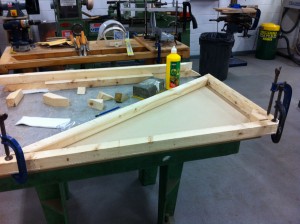
Due to the obvious weight difference in the full size version of the prop each component had to be well built to avoid any accidents. Each triangular section was reinforced with pine timber baton which was glued and screwed into place.

IMG_9988 IMG_9989

‘Good communication with other parties was also key as the success of the project was highly dependent on fittings in the Academy and the synchronisation with projections. Resolving issues far in advance meant the on-site build and event itself ran smoothly.’.
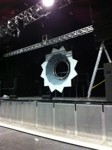
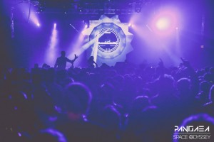
IMG_0143In place at the venue, the stage prop served as the focal point for the nights performers and was lit by constantly changing projections and light displays. The image below shows the piece on stage before the event began. The image below show the finished piece during the live event.10887278_461189607366949_5284888234544424655_o 10955797_461189257366984_3543354359810081653_o 1606453_461189224033654_1058877598167468098_oComparing Peter’s prototype to the completed piece shows very little structural difference and is yet another example of how a test model can serve to prove a design idea. Both the development and final versions of the project will make great additions to Peter’s portfolio with the two conveying his design thought and testing processes to a potential client or employer. You can see more of his work here.
City Tower Project, 1st Year ‘Group 8’ Paradigms Project

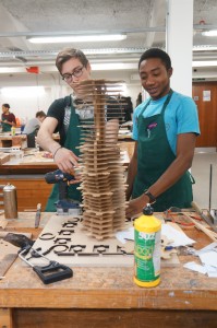
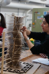
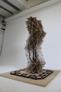
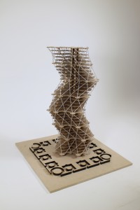
This first year group, also looking at the work of Louis Khan, have been looking at the un-built City Tower Project. The design was  intended to be built in Philadelphia in the 1950’s but stopped after several stages of development. despite this it is still regarded as an important study and influenced future designs with its use of space frame technology. (Albani, 2013)

DSC02242

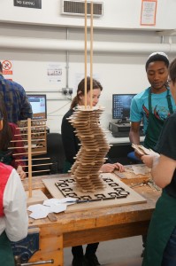
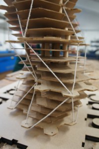
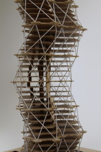
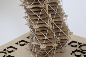
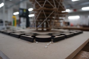
The group used laser cut floor and base plates to build the structure around central wooden dowels as the building core. The outer ‘web’ skin the binds the floors was represented with string threaded through pre cut holes in each plate.

DSC02246

DSC02260 DSC02259

The group used our new studio space to photograph the model against a white backdrop.

First Year Louis Kahn Architects study (18) First Year Louis Kahn Architects study (19) First Year Louis Kahn Architects study (21) First Year Louis Kahn Architects study (22)

As several people pointed out, the addition of scale people and cars really help to convey the size of this design to the viewer.

DSC02265

Albani, City Tower, Architects,Architecture,Architectuul, [Online Article] Available from: http://architectuul.com/architecture/city-tower , 2013

Subvert Skate Park, Saskia Furman

This site is currently a car park in Manchester’s Northern Quarter. Saskia’s 3rd year proposal for this site is a new development providing a space for the ‘socially un-welcome’. The development would include a skate park, hostel and other spaces for urban sports.

For this project Saskia used different coloured acrylics to represent different sections of her proposal.

This type of model is sometimes known as a ‘Jewel model’ due to the illuminated effect given by the coloured acrylics. Commercially this type of model get’s varied use.

Architects Rogers Stirk Harbour & Partners favour this style of model during their design development stages.  Providing the CAD files are set up and drawn correctly this type of model can be a great quick addition to a project, this example took around 5 hours to draw, cut and assemble incuding some trial and error!

Mayfield Redevelopment, Joseph Hamblin

Josephs description of his project:

My initial place/non-place study of mayfield highlighted the temporality of these ideas. To me mayfield was an area made up of and defined by working relationships, it is fragmented from its urban context and the activities on site work around one another rather than with one another. I wanted to create a unifying vision which responded to the existing urban condition and tied the fragmented territory together. My project brings ideas of knowledge exchange and open source information together to create a platform for innovation on both a personal and corporate scale.

It seemed very fitting for Joseph to use 3D printing to convey his ideas in his model. The idea behind his site redevelopment was that individual business units can be extended or reduced by simply adding or removing sections. New units would be created on site and moved into place using a rail system.

3D printing also lent itself to the mechanical side of the design, allowing moving components such as wheels and the rotating walkways.

In keeping with the new meets old theme on Joseph’s site he decided to keep the reclaimed piece of teak ‘as was’ with its scratched paint and chipped surface. This works really well in creating contrast and makes for a really nice object aside from its relevance to the design concept.

Joseph Hamblin.jpg 3 All Photographs shown here are taken from Joseph’s web page. Click here to see more.

‘Trimo Urban Crash Bike Base’ Competition entry, Alexandr Valakh

This competition entry was completed in January 2013 by 5th year MA Architecture student Alexandr Valakh. Here is a brief project description taken from Arch Daily:

‘In digital imaging, a pixel, is a physical point in a raster image, or the smallest addressable element in a display device; so it is the smallest controllable element of a picture represented on the screen. The pixel is a multifunctional Cafe and Bike storage repair stop, designed on an orthogonal grid, with entirely adaptable elements including optional layouts and furniture arrangements. The Pixel like its name sake is in an adaptable social environment designed to to create a new and flexible social public space.

These spatial responses include differing strategies for Daytime, Nighttime as we all as
different strategies which can be implemented to respond to environmental/seasonal factors, site conditions as well as security requirements.’ -Alexandr Valakh

01032013 supercrit CS4.indd 01032013 supercrit CS4.indd 01032013 supercrit CS4.indd

Alexandr used laser cut ply wood to create this concept model showing how his proposed design would look in relation to its surroundings. He also used a minimum of contextual details such as people and a car to further convey its scale.

01032013 supercrit CS4.indd 01032013 supercrit CS4.indd

In addition to the context model Alexandr produced a detail model of the units construction featuring laser cut bike silhouettes. The level of detail shown in this detail model would be inappropriate on the smaller context model.