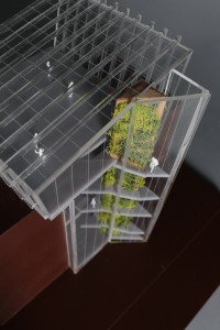
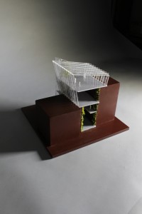
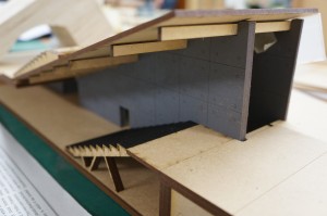
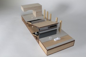
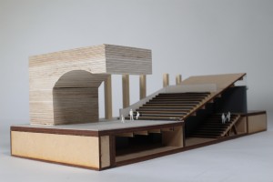
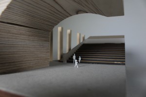
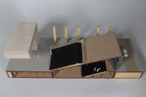
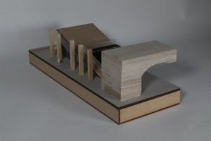
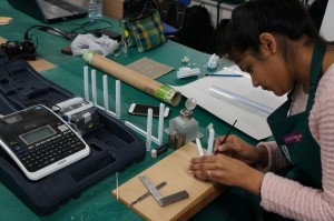
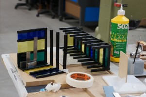
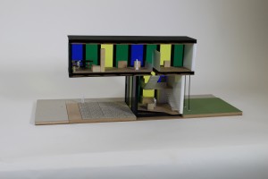
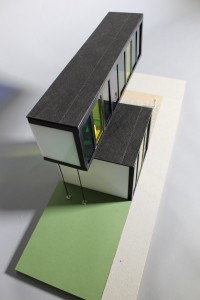
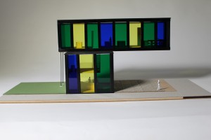
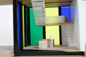
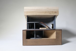
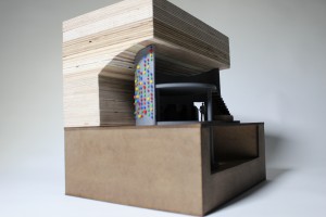
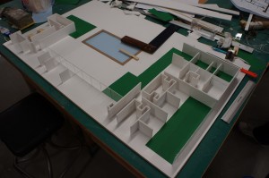
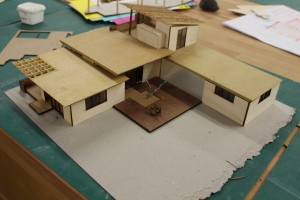
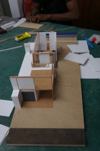
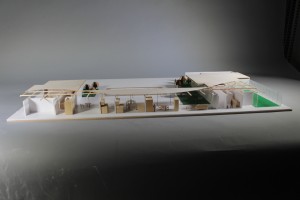
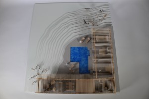
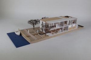
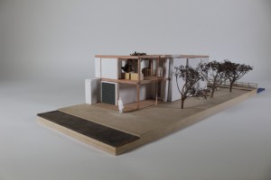
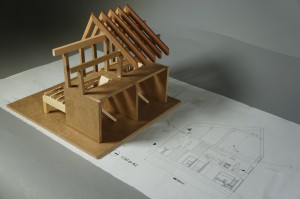
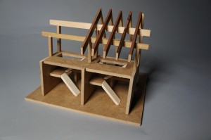
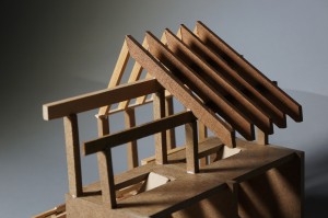
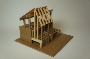
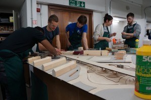
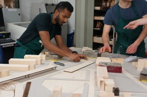
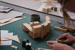
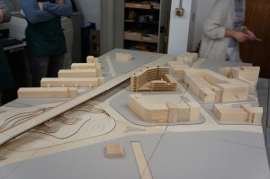
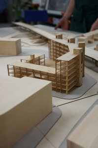
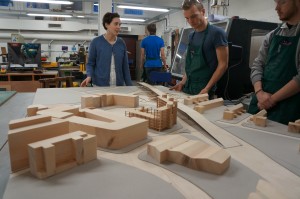
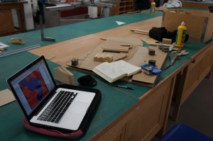
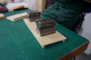
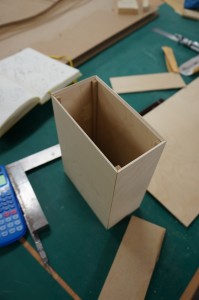
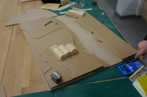
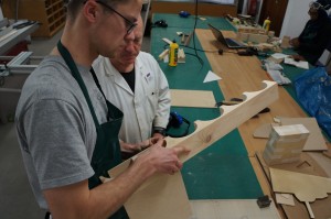
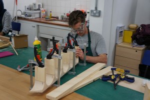
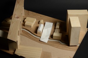
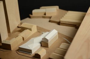
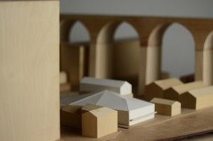
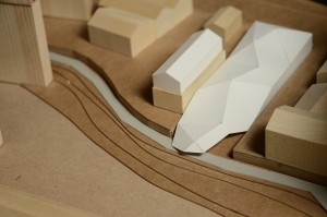
1:100 ‘Performance Centre’ Cross Section Model by Philip Lam

Philip Lam explains to us how he used his model to convey his ideas for increased space and performance capacity:

Phil Lamm (1)

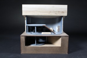
“On a site with limited space, my design tries to increase the audience capacity of a performance centre. The main space is found underground while the introduction of an outdoor space sits on top. The exterior space has been designed to respect and interact with its surrounding buildings.
The idea behind this model was to communicate and understand the spatial and structural qualities of my design.
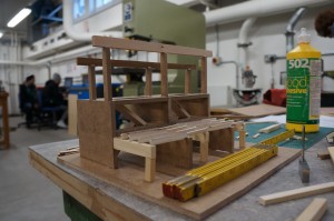
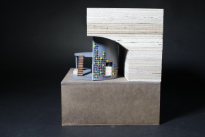
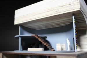
As part of the brief, our tutors asked us to include a staircase and double volume room. By making a sectional model, it is possible for a viewer to see these components as well as help understand the use of space inside. Also by modelling a section cut, my buildings load bearing structure had to be modified to allow for missing components.

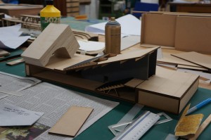
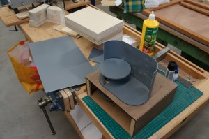
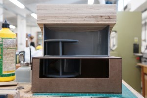
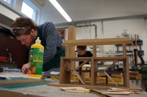
Phil Lamm (2) The material primarily used in my design is concrete. To mimic this in my model, I used laser cut MDF covered with spray painted sandpaper. Rather than making a mould and casting it, this was a quicker and more economical representation of the textural and structural qualities that were required. The half-arch was made using plywood blocks which were stuck together, cut and shaped using the band saw and bobbin sander. The grain in the plywood helped replicate brick and mortar. For the seating, I needed a material which is thin, yet strong enough to sit on the wooden support frames and decided on using mount board. Finally, I used laser cut frosted acrylic pieces to represent the translucent cladding found in my design.

Phil Lamm (3)

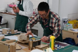
By making this model, I have gained further experience working with new materials, tools and techniques. I have realised that using the laser cutter is a fast and precise way to cut materials, but it can also slow you down if there are errors in measurements and tolerance. Careful planning before starting is essential. I really enjoy the process of constructing a good considered model and it is invaluable in further helping evaluate my design.” 

IMG_8786

Philips project pays attention to construction detail and his considerations with regard to material constraints and component accuracy come across well. It’s great to see turning points in project and there were several such points in this one. Philips model threw up issues such as floor levels and door placements that, once evident, were resolved through further making. We look forward to some more projects from Phil next year!

IMG_8791 IMG_8807 IMG_8812 IMG_8822

1:100 ‘Parasite’ Context Model by Anca Trimbaciu

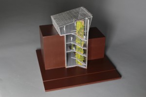
This case study by Anca Trimbaciu shows us her proposed building within its enclosed site context of two existing buildings. So as not to take the focus away from her design the massing of the context buildings was kept simple. Anca wrote down her thoughts on the project for us:

“As part of first year’s final project we had to go the extra mile in explaining our design and idea. Therefore, we had to create a presentation quality model. My entire year revolved around butterflies, that being the animal I chose, so my building was also connected to them, being an indoor butterfly garden, a space for recreation and relaxation.

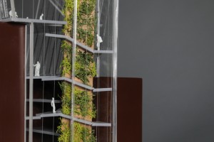
My design is a parasite building in between other two existing ones, which covers a very small space and puts focus around the staircase and the idea of ascension. As you move up you gradually discover spaces that are more open and luminous until the last floor which allows a panoramic view of Oxford Road from the inside of a “green utopia”.
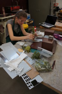
Anca Trimbaciu (5)The model shows context, size and the purpose of my building. A section in the back of the model allows the viewer to see inside and observe how the building makes use of the adjacent existing buildings and how double volume appears during the ascension towards the top floor.
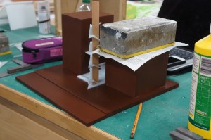
DSC04225

I used painted MDF for the adjacent buildings and the base of my model just to give an idea of their size and appearance, contrasting with my design through colour and texture. Other than that, the rest of my model is mostly made out of clear or grey acrylic as it was the best choice to either represent glass, metal or polished concrete. The triangular staircase is sustained by a wooden column which is covered in vegetation. Because the scale is only 1:100, I opted for showing ramps instead of creating each step out of acrylic.
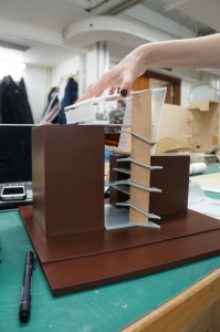
DSC04227

During the making of this model I had my first attempt at using Autocad and laser cutting, and surprisingly, I succeeded. I learned how to spray paint in order to completely cover the texture of a material and I improved my skills in working with acrylic. I also got the chance to fully understand my building and its structure.

It has been two well spent weeks in the workshop and I am looking forward to my next project, even though starting a model might be scary at first, the results are most of the times really impressive and worth the time.”
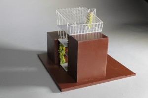


Anca Trimbaciu (9)

The construction method for this model was well considered and, much like the building process of a 1:1 project, the order of assembly was orientated around the ‘core’ access, in this case stairs, providing support for the different levels.

Of particular merit here is the consideration to how the massing was created. Rather than being solid blocks, the context massing was made up by creating hollow boxes which were then coated with sanding sealer, sanded and painted. This method saves on material and overall weight of the model and can often be done for free with off-cut material.
Anca Trimbaciu (10) Anca Trimbaciu (13) Anca Trimbaciu (14) Anca Trimbaciu (18)

‘Peacock Museum’ 1:50 Cross Section Model by Mahishini Vasudevn

DSC04037

In another First Year case study we asked Mahishini Vasudevn to tell us about her recently completed project for the ‘Resolution’ brief:

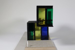
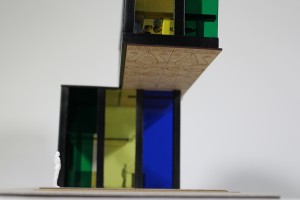
“For our first project, habitat, I chose Peacock as my animal client so I made a design that would stand proudly and attract the eyes of the people just like the Peacock would do. To portray this, my design had a cantilevered floor which protrudes over the pavement of my site in Charles Street. The facade was designed to have stained glass which had the same colours as the peacock. In my design I have mainly focused on grasping the attention of people instantaneously.

In order to convey the most information about my design, I made a sectional model to give an insight to the structural aspects and the interior detailing of the design like the cantilevered stairs and the circulation around the building.

DSC04091

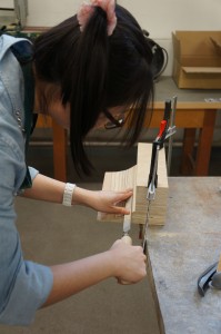
In the case of materials, for the glass facade I have used coloured acrylic as it best represents the colour and transparency that is implied in my design.  As for the columns, beams and floor joists I used Styrene H-columns which were sprayed in black to represent steel frames. The floors were made with MDF wood to replicate the wooden floors. The pathway with granite paving slabs was laser engraved on grey card to show the colour and the small amount of texture that I wanted to show. The interior was done with wood and acrylic. In my model I have tried my best to produce them in such a way that they almost represent the same materials that would be used in reality if it were to be built.
DSC04135

Through making this model I have learnt new techniques of model making. It has taught me more about my design like the structural connections and how a design comes together as I was able to have a 3D view of my design. I’ve learnt how to plan my work and handle time with care.
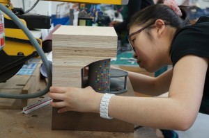
Model making has been the best experience I’ve had as a first year architecture student and I’ve enjoyed working in the workshop.”

IMG_8084 This model is put together with a good selection of materials that help to demonstrate the different component of the design shown in section. Mahishini made good use of pre existing strip materials by choosing styrene H beams to construct what would be the steel frame of her building if made at 1:1. Strip materials such as these are extremely useful in section modelling and we hope to stock a range in the near future. In the mean time they are available from 4D Modelshop where you can also register for a student discount quoting either myself or Jim as your tutor here at Manchester.

IMG_8152 IMG_8244

IMG_8088 IMG_8248 IMG_8250

‘Arch Game Lab’ 1:50 Cross Section Model by Estelle Xin Yun Ang

DSC04032

First Year Student Estelle Xin Yun Ang has just completed a 1:50 section model of her proposal for the re-purpose of vacant space under a railway arch way. Estelle kindly described her project for us:

“I chose to build a model in which part of the facade was removed to communicate the details of interior spaces and the assembly of structural components. The railway arch was modelled as a section to show how it acts as the ceiling of my design. I modelled the underground and made a window to give a good view into the basement. The facade detail was quite important in order for me to express the sense of gaming, which was why I took the time to paint the tiny offcuts.
DSC04082

The exterior spaces surrounding my design is extensively graffitied which inspired me to design a gaming studio where the potential of play is explored. I incorporated game buttons into the design of the facade to convey my idea of gaming.

DSC04092

To model the context, I decided to use plywood as the texture provides a good representation of the brickwork for the archway. For the ground/base, I used mdf wood and applied wood stain to give a good contrast to the light coloured arch. I spray painted the laser cut mdf in grey to show the concrete floor plates. For the walls I chose to use vac-formed styrene to achieve a permanent curved shape. I added strips of acrylic between the two pieces of styrene to make up the thickness of the wall and that helped save some material.

DSC04120 DSC04139


I overcame the difficulties of modelling the curved shape of my design and I have learned to use different techniques on different materials to achieve the best result. After a few trials and errors I was able to understand the construction of my design. This is what I find interesting because there are so many ways in making a model and through experimentation I get to know which method works best for my design.”
IMG_8220 IMG_8226 IMG_8228

What is clearly shown in this model is the attention to making each element correct for assembly. This patience and consideration is something we should all aspire to when designing and making. Often one of the hardest things to do during a project is accept that something you have made is incorrect and should therefore be re-made. Whilst this may seem like wasted time it is exactly the opposite and by taking a step back from the project to look at what you have learned you will see that such mistakes are necessary for your own understanding of the design as well as gaining a better understanding of material and machine constraints when making.

We hope to see more projects with this level of thought and consideration in the coming weeks leading up to the final submissions and in future first years.

IMG_8259 IMG_8262

1st Year History of Architecture Paradigms Project

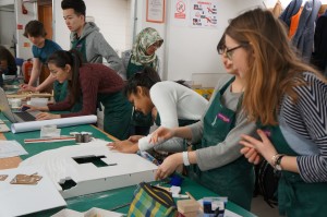
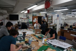
We’ve had a busy few weeks in B.15 with the last week and half dominated by this first year project.

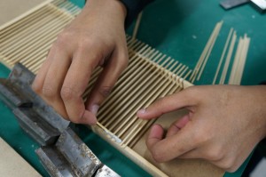
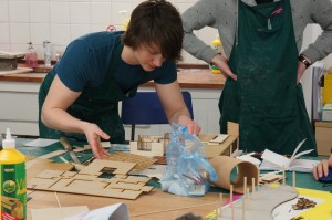
In conjunction with a series of paradigms lectures first year students have been asked to choose a piece of historically significant architecture to replicate and study through multiple means. One of the requirements of this brief has been to produce a section model allowing the observer to view the construction framework and internal layout of the building they are looking at.

1st year paradigms 2015 (6)

1st year paradigms 2015 (1) 1st year paradigms 2015 (7)1st year paradigms 2015 (10)

The results from this have been very good with groups taking time to consider different aspects of the real constructions and how they might best be represented at scale and within the time frame allowed to produce the model. Materiality was a prime consideration with the most successful examples providing a balance of different materials across the model construction.

1st year paradigms 2015 (8)1st year paradigms 2015 (22) 1st year paradigms 2015 (9) 1st year paradigms 2015 (11)

Things to Consider: Always Printing Plans

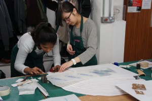
One crucial part of getting these projects started was to get correctly scaled plans printed for reference. A number of groups hadn’t considered this necessary as they had smaller plans and scale rules for conversion. We highly recommend getting at least one printed correctly scaled site plan for reference when producing your models. Without one to hand you will spend a great deal of time referring to cad or wrongly scaled drawings for reference when you could easily be comparing your model components to an accurate plan on your desk .

1st year paradigms 2015 (12) 1st year paradigms 2015 (13)

Photographing Models

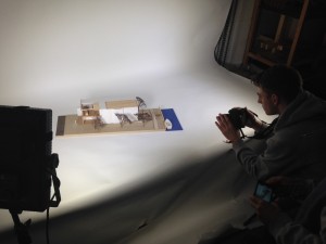
As part of submissions students also had to produce a pamphlet detailing the key facts about their chosen piece of architecture. This meant taking photographs for their models had a duel use providing images for their pamphlet and their portfolios. Anyone wishing to use the studio space to take photos of their current or past work should drop in and we can advise on availability and help you set up to shoot.

image3

1st year paradigms 2015 (14)

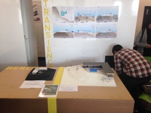
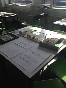
Stahl House 22 (9)Frank House (20)Frank House (27)The completed models were then placed together with the other submission requirements in a small exhibition of paradigm studies back at the studio space.

image1 image2

Some great work and valuable lessons learned for all – first years are really pushing the expectations for the next waves of students! Well done everyone – see you for the next project!

Scott and Jim

‘Retrofit’ Structural Study Model by Paul Thornber

Paul Thornber Structural Dteail (6)

MSA Praxis student Paul Thornber produced this ‘rough and ready’ sketch model in just 6 hours and cost him the grand total of £0! Made entirely from waste scraps this model clearly conveys the structural arrangement of Pauls project without need for expense or time consuming methods. More importantly the process of planning, marking out and making the model has been a learning experience as Paul describes below:

“I intend to use the model to explore how structural decisions affect spatial conditions.
The model was used to help make decisions, in the development stages, regarding structure through experimentation.I was able to economise on structure through building at scale and assembling the model by hand.It also helped me prove that I understood how the buildings structural strategy worked.

Paul Thornber Structural Dteail (10)

Through making this model I have learnt how to form and develop the plan of a building through a process of experimentation in both 2D and 3D.
Quickly switching from plan to section to model and back again helped me rapidly develop ideas that worked both on paper and in 3D.

Paul Thornber Structural Dteail (56)

This model gave me an insight into the next stage of model making for the final output of the next project. I will now know what works and what doesn’t before starting a more refined version of this model.”

Paul Thornber Structural Dteail (40) Paul Thornber Structural Dteail (23) Paul Thornber Structural Dteail (12)

This is how the medium of modelmaking should be used in my opinion. By employing making as a tool to develop your ideas you are opening up yourself to technical processes, material constraints and lessons that can be directly transferred to your design decisions when working at to 1:1 scale design.
You can see more of Pauls work here: http://www.paulthornber.com/

Scott

Coexistence in Theory 3rd Year Mancunian Way Site Plan

3rd year Coexistence in Theory has been focussing on a stalled site located next to the Mancunian way in Manchester. The group will use this abandoned infrastructure to propose new interventions that will bridge the site bringing in to back into functional use.
3rd Year Site Model (1) 3rd Year Site Model (4) The group decided to represent a large portion of the Mancunian way which runs through the city along with building massing and defined roadways across the site. This was done by overlaying grey card board pieces to act as raised pavements creating contrast with the light coloured plywood base below which provides the road areas.

3rd Year Site Model (11) 3rd Year Site Model (7)The stalled site in question is represented in more detail due to its importance and comparative skeletal appearance to the rest of the buildings in the area. This was made using laser cut ply whilst the main massing of the rest of the model is made us of blocks of pine cut and sanded to shape.

3rd Year Site Model (13) 3rd Year Site Model (16) Group member Georgina Erotokritou described why the group are producing the model for their projects:

“It’s the easiest and most understandable way to explain ideas, space and arrangements in 3D space. Because this model covers a wider context it is easier for the viewer to see the entire picture and see how our buildings connect to the site.” 

The model is now being used as a stage to present the groups ideas as they develop throughout the year.

3rd Year Site Model (17)

Stockport Site Massing Model by Finbar Charleson

This project looks at a site sandwiched between exiting buildings and natural boundaries in Stockport centre. As with most of the projects I have seen Fin work on it’s great to see someone using a variety of media on their desk to inform the decisions in making and in turn use the results to influence their ideas.

As the site includes several large tower blocks it was decided to create the masses as hollow boxes to both save on material and weight of the completed model. The box sections seen here were carefully made up from planes of material – most of it scraps from other projects. 

Once again being concious of material use, Fin designed his contour base to be laser cut into steps with supports as opposed to entire sheets. This again saves material and overall weight. The process requires some minimal extra consideration when producing drawings but the savings are great and well worth the effort. Read more on this method of construction here.

To create the imposing and dominating viaduct feature which spans across the site Fin chose to use a solid mass created from pine. The arches were drawn out and rough cut on the bandsaw before being sanded smooth.  Legs for the viaduct were created as separate pieces with varied heights depending on their position across the contours. The legs were then clamped and glued over night.

Finbar gave us a few words reflecting on the project so far:

‘The model has helped to negotiate a complicated landscaping condition, in that the envelope links three different levels: water, ground and the 1st floor gardens, of a proposed Waste Water Treatment Plant in Stockport city centre. The context is modelled with traditional craft methods as I feel the site has a great sense of history, including the famous  Stockport Viaduct. It has helped to explore sensitive ways of repurposing existing warehouses I used Pepakura software to produce nets of meshes generated in Grasshopper for Rhinoceros, for the initial massing proposals.
The next step is to combine the spatial arrangements of the building with environmental analysis and try new massings on the same model.’

The completed model has a removable site section to allow different proposals to be inserted into context. Fin has already made several suggested forms from card as seen below. Finbar Stockport Model (15) Finbar Stockport Model (16)Finbar Stockport Model (18) Finbar Stockport Model (17)


CNC Software Issues – Machine Out of Action

Be advised that we are experiencing some software issues with our CNC router. This may mean a knock on effect with booked jobs. The issue is ongoing and may not be rectified for the next few days. Please check in with us if you are booked to use the machine. If your project is urgent we recommend checking availability at MMU and FAB Lab Manchester as an alternative.

Apologies for any inconvenience caused. We will post an update when the issue is rectified.

Scott and Jim