B.15 Top picks from the Biennale Architecttura 2023 – The Laboratory of the Future

Back in June we hosted a symposium called MAKING SCALE as part of Venice Biennale Sessions. Outside of the event we were able to view the full exhibitions across the two main sites at the Giardini and the Arsenale. Reflecting on our time there the workshop staff have each picked their favourite display and summarised their thoughts on it below. If you have chance to catch it before it closes in late November let us know your thoughts! – Scott, Lara & Sarah

Scott’s pick:

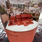
Renewal: A Symbiotic Narrative – Peoples Republic of China 

La Biennale di Venezia – Arsenale  

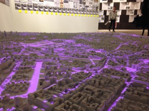
I’ve been fortunate to be able to visit the Biennale several times in the last 10 years. With varied themes to explore each year across the various exhibits. I’m primarily looking out for presentation techniques and of course, anything that makes use of models to convey a message. The space occupied by the Peoples Republic of China at the Biennale’s Arsenale site has often presented a challenge for its curators in terms of its sheer scale. The display occupies one of the largest single spaces across the two main sites meaning it’s contents either have to match that in terms of the chosen artefacts or, using creative display mediums which effectively fill the space. I’ve chosen this as this year’s standout exhibit from a display point of view.  

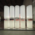
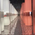
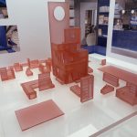
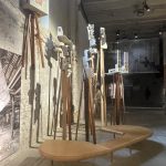
The exhibit uses a common language of materials throughout which clearly identify the contents as part of the same focus topic. Exploring the theme of laboratories and experimentation, the curators chose a range of case studies from across China that have in some way informed improved liveability in high-density built environments across the country. Quoting from the exhibition catalogue, “more than forty scroll-like columns […] generate the experience of being in a metropolis” (Xing, 2023).  

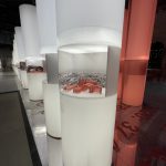
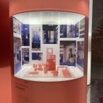
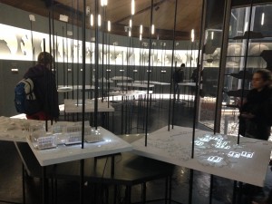
Within each of these columns’ visitors can view a model of a site study that is supported by context information and imagery that steps forward through time as the density of urban areas increases. 

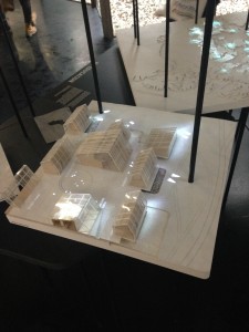
At the far end of the rows of columns the curators placed a mirror wall which adds to the feeling of density of depth to the already huge space. The floor is also mirrored and features the year-by-year chronology of the exhibits. The columns themselves are internally lit with a frosted finish in light red and white. This theme is continued in the models themselves which always stick to this colour pallet. Materials used are primarily frosted acrylic which has been laser-cut, combined in some cases with resin 3D printed elements to match the light red/pink hues that occur throughout. Model scales vary depending on the subject site being presented. 


I find this consistency in language very effective when it comes to subconsciously linking different pieces together. This is something I encourage our students to consider when producing sets of models, keeping in mind the broader style choices of their project presentation.  

Overall, I feel this exhibit is neatly put together and the simple consistency of its contents help to make a huge space feel sufficiently populated with what are actually quite small exhibits. 


Xing. R (May 2023) Renewal: A Symbiotic Narrative (P27), Biennale Architettura 2023 The Laboratory of the Future Participating Countries & Collateral Events, La Biennale Di Venezia 


Sarah’s Pick:

Not for Sale!! – Canada 

La Biennale di Venezia – National Pavilions Giardini   

This was my first trip to the Venice Biennale and initially what struck me was the vast range of work on offer. Across the exhibitions there were so many varied techniques including textiles, model making and film all with the aim of getting their personal view/ message across. The scale of the event also took me by surprise as I was unaware of the vast expanse the biennial had across the city.  Some highlights include, Switzerland’s pavilion ‘Neighbours’, which featured a giant carpet which explored the themes of proximity and relationships between the pavilions themselves. As well as Chinas pavilion which featured a large collection of rose prink models that showcased different ways the ever growing population could utilise space in city’s.  

However, my personal favourite exhibition and the one I’ve chosen to discuss is Canadas pavilion ‘Not for sale!!’. One thing that really stuck out to me was the consistency throughout the pavilion and how they’d chosen to present the work. The site models themselves looked like a miniature version of how they had adapted the building.  
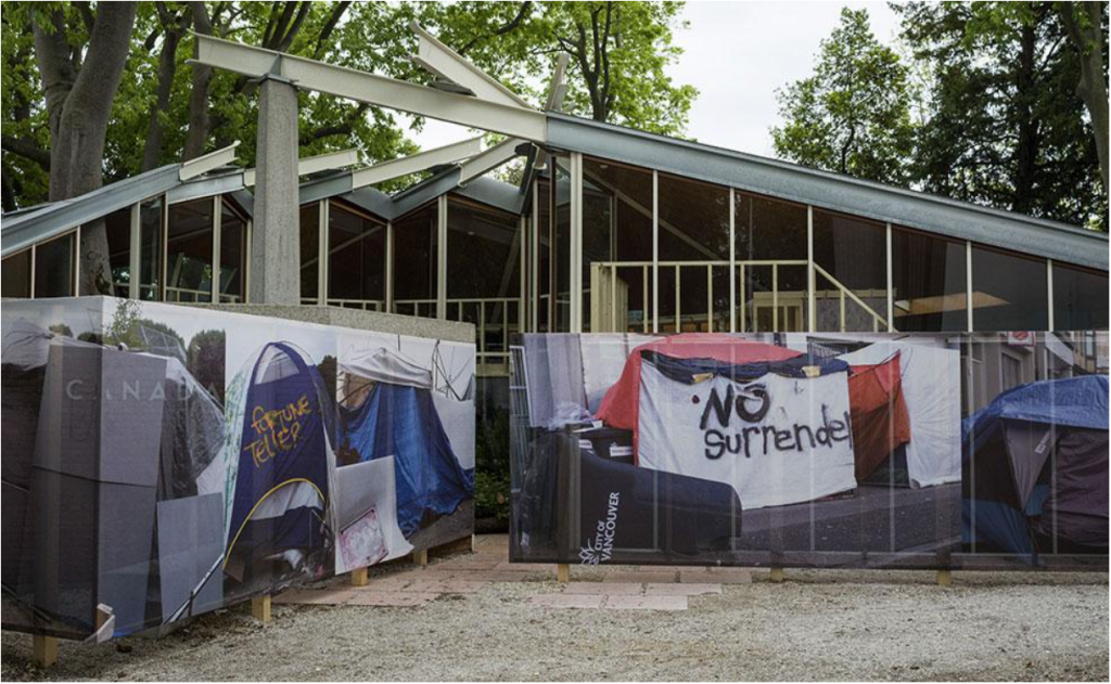
Exterior of the Canada Pavilion 2023. Image Source: https://www.labiennale.org/en/architecture/2023/canada

The exhibition comments on the changing and growing gap between housing that is causing a classist urban environment, where the richest in society benefit from gaining more properties and the poorest are left in a bad living conditions with extortionate rent prices making their access to the housing ladder almost impossible. I found this angle interesting as ‘Architecture’ is the source of the problem but it can also be the solution. I took away from the exhibition the injustice that people who already have money can freely put it into more property getting richer and richer whilst doing no work, whereas people grafting daily are in a situation where a decent home feels like a luxury. An imbalance that is prevalent in much of the western world, inclusive of the UK. I felt the topic they had chosen to explore was relevant and the models used to convey the issue pushed the message by using clear visuals. 

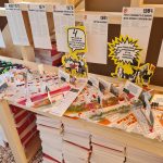
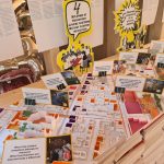
The pavilion itself had been adapted to suite the theme, being made to look like a rundown building from the outside, with boarded up panels and graffiti to represent visually some of the homes people are being forced to live in because of the housing crisis. ‘Not for sale!!’ was not only an exhibition held at the pavilions in Venice but also a live campaign to end the housing crisis. The pavilion acted as the headquarters, connecting activists and architects in one space, all with the aim to improve housing accessibility. The inside of the pavilion reflected this giving the impression of somewhere a revolution could be started. The space felt like a cabin, almost as though you were outside on the side of a protest. The models were simple, but brightly coloured so you could identify different areas and featured giant speech bubbles gave them an almost ‘pop-art’ Andy Warhol feel.  
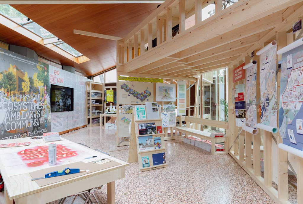
Inside the Canada Pavilion. Image source: https://worldarchitecture.org/architecture-news/fzecp/canada-pavilion-explores-tangible-forms-of-housing-crisis-at-venice-architecture-biennale.html

Many of the visuals including the models, posters and leaflets had recognisable visual such as a ‘Raised fist’ synonyms for the Black Power Movement, re-designed into a more modern style. Overall, the themes throughout the pavilion effectively strongly showcased the messages of ‘change now’ and ‘action needed’. The models were made from card and paper which to me reinforced the idea of limited resources and looked as though they had been made with solely hand-crafted techniques. This style of making is something I will encourage students to take forward within their own work as it is showcased clearly that simple techniques and shapes can create great results. The neon colours gave all the models a strong visual language that was carried through the space. I really enjoyed the incorporation of words and questions within the site models and the interpretation that models are not just a representation of something that is proposed and will happen, but instead they can be something used to inspire a better future. They featured questions about how we could readapt and make spaces around us more accessible, making you reflect on how we use and create places for example, ‘What if we, were outdoors more? With safe spaces for children?’ 

Overall, the movement & exhibition was positive, bringing together people to push social mobility within housing. The models used represented the change that people part of the agenda wanted to see and the whole space was utilised well. 


Lara’s Pick:

‘Emotional Heritage’ – Flores & Prats Architects
As part of ‘Dangerous Liasons’ for ‘The Laboratory of the future’ curated by Lesley Lokko 

La Biennale di Venezia – Le Corderie dell’Arsenale 

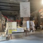
I was fortunate enough to visit the Biennale for the first time this year. The Venice Biennale is an international cultural exhibition hosted by the Biennale Foundation in Venice, Italy. There were many exhibits in various locations around Venice to see and explore, all linked to themes around architecture. I was particularly interested in seeing how models were used internationally by architectural practices and how these were displayed. I found the site at le Corderie dell’Arsenale particularly interesting with its selection of architectural practices and design studios in ‘Dangerous Liasons.’ An exhibit that stood out to me most in the collection was Flores & Prats Architects ‘Emotional Heritage.’  

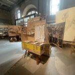
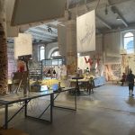
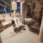
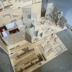
As soon as you walk into the exhibition, you are met with a busy room full of drawings, photos, films and models of varying details, scales, and purposes. On the tables and installations around the room they introduce six of the projects that the practice has been involved in. All of these projects showcase an ‘Emotional Heritage’ approach of the practice through interventions into existing buildings and the memories held inside. 

Parts of the exhibit are presented as if the project is a work in progress, allowing visitors to experience the inner workings of the design process leading up to a finished product. This fits very well within the curator’s overall themes of laboratories, imagination, and experimentation. The themes run throughout the exhibit, creating an atmosphere as if you were inside their Barcelona studio. They demonstrate a variety of model types including presentation, sectional and sketch models displayed on stands and in bespoke display containers. They also showcase animations of using models in an interactive way to explore the narratives that shape their final products.  

The exhibit demonstrates a variety of materials and processes, although predominantly they have chosen to use handmade processes to explore design ideas. It is interesting because the use of digital fabrication machines is often the first thought of students wanting to make models, but here is a demonstration of a practice showing that this is not a necessity. I often encourage students to consider both digital and manual fabrication methods depending on what they are trying to communicate whilst considering material, cost, and time. This is an architectural practice that uses modelmaking throughout the design process and showcasing this opens it up for discussion. 

A particular favourite model of mine in this exhibit is the model of the exhibit itself. I love all the small, intricate details and how it was used as a tool to help inform the design of space for the exhibit. Even after the exhibit is erected, it still offers value through the capture of a moment in time which very much relates to the practices approach of memories within a building for ‘Emotional Heritage.’ 

Overall, I feel this exhibit offers a great insight into how Flores & Prats Architects use models, drawing and film to create discussion between visitors, clients and builders of their architectural designs. They very much use model making as a tool throughout the design process to explore and develop ideas before coming up with the final design. 


WHAT WE DO HERE – Premiere and residency at TIME SPACE EXISTENCE during Venice Biennale 2018

On Friday, 29 June the Venice Biennale saw the premiere screening of WHAT WE DO HERE; a documentary film about the role our modelmaking workshop plays in student and staff learning and development. In the basement of Humanities Bridgeford Street you’ll find the B.15 Modelmaking workshop which has served our architecture department since 1970.

The long-established workshop introduces students at both undergraduate and postgraduate level to modelmaking as an important design tool.

Documentary film makers Kieran Hanson and Howard Walmsley set about recording the plethora of daily happenings in the workshop environment back in September last year. The aim was to explore modelmaking pedagogy for the many students and staff at Manchester School of Architecture which frequent the workshop space. MSA is a joint school across our university and Manchester Metropolitan University giving students the benefits of both campuses.

Screening at the prestigious Venice Biennale gave the film the perfect setting. Architecture practice Feilden Clegg Bradley Studios Simon Doody and award-winning furniture maker Hugh Miller presented before the screening which led to a constructive debate on the subject of making in design.
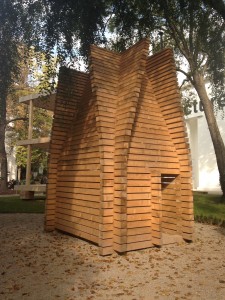
The film is now resident at the Time Space Existence exhibition space at the Palazzo Bembo on the famous Grand Canal. Entry is free, and it’s expected to attract many thousands of visitors across the summer up until the end of November 2018.

The completion and promotion of this film and its associated events would not have been possible without the University’s Investing in Success scheme which backed the project. The workshop team is currently planning a number of local screenings and UK events that will feature the film in the coming year.

A huge thank you to all who have contributed to this project in time, funding and above all morale support over the past academic year that has made it all possible. We’ll be announcing additional screening events in the coming months so keep a look our for those.

If you get a chance to visit Time Space Existence in Venice, tag @b15workshop #whatwedoheremsa on social media and enjoy!

Scott & Jim

UPDATE: With the conclusion of our associated events WHAT WE DO HERE is now available to watch online here. Thank you to everyone who has supported and engaged with the project!

WHAT WE DO HERE – TRAILER

At long last we can reveal the trailer for our upcoming anthropology documentary film “WHAT WE DO HERE”

WHAT WE DO HERE explores how aspiring architects at Manchester School of Architecture approach various stages of modelmaking as they grapple with materials, methods and machines to ultimately reveal the ways in which the models inform their individual growth and understanding. In addition to this it examines the ways that staff integrate practical making into their requirements for student assignments and within their own research projects.

Premiere Screening and Debate June 29th

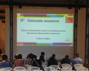
The film will premiere at in Venice at Biennale Sessions, Special programme for higher education institutions at La Biennale di Venezia’s 16th International Architecture Exhibition. The screening will take place at 15.00 at the Venice Arsenale Sale D’Armi followed by speakers and a debate on the subject of making in design. Speakers will be announced shortly.
TIME SPACE EXISTENCE June 30th – November 25th

The film will take up a 5 month residence at Palazzo Bembo as part of the TIME SPACE EXISTENCE Collateral Biennale exhibition. WWDH will be screened on repeat during all opening hours at Palazzo Bembo near the famous Rialto Bridge.
Venice Biennale 2014

By now there have been hundreds of on-line reviews of the Venice Biennale which is this year focused around Architecture. The Venice Biennale is an annual event that showcases the creative arts from across the globe. Having been open since the start of June this year, the show is almost coming to its end having seen thousands of interested visitors of all backgrounds. My visit last week coincided with the 5th year study trip which basically allowed students free reign over the site and city.

My interest on the site is of course about the varied use of models. There was certainly no shortage of examples. Each international pavilion display addressed their own study of architectural fundamentals and the use of models played a regular and prominent role. As there were so many examples I will summarize my visit by including images of the examples on show and pay particular attention to contemporary methods of display which noticeably inspired many of the students I was with.

Finland – This pavilion was curated in a clear a concise way that explained the concepts in drawings, writing, models and the full size buildings on display outside of the main space. This method of display for the project was great and makes for easy understanding by any visitor. It’s probably worth taking note of this narrative when thinking about the display or presentation of your own projects.


The use of timber pieces accurately cut for the model (above) translated directly into the construction of the 1:1 construction (right).


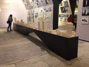
Austria – Now as popular as they are amongst established architects I’ve never been a huge fan of the ‘White Model’. I’m not sure why but I suppose it feels like a stark and almost clinical representation of a form which in reality has much more texture and thought behind its finish. That said, I’ve made many of these for clients and of course pursue the whitest of white finish to meet their brief. The Austrian pavilion presented a bright white room dotted with white block models of every one of the worlds parliament buildings (above left and below). I thought it was fantastic and enticing as did so many other visitors who spent a substantial amount of time examining the many models on display. This was an interesting subject matter to study in model form due to the ‘god’ like decisions that come from each of these buildings across the globe. One of my favourite displays of the show.

Projection Models – There was a noticeable buzz around the use of projectors to animate aspects of otherwise static models from the students I was with. Whilst this is something we have looked into before there were several good examples used across the Biennale.

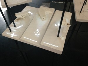
The Canadian pavilion made extensive use of the projection model with micro projectors mounted above white site models. Each model showed traffic flow trends and potential variants in the environment around the site. Anyone wanting to attempt a similar project should start by looking at the type of projector you want to use as they can be expensive and planning their set up in relation to the model is crucial.


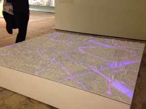
The Italian pavilion made use of a similar projection set up but was across a master plan model showing city routes toward and around particular hubs of activity.


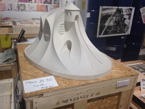
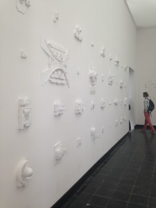
Also on display in the Italian Pavilion was a host of plaster cast models (right) each with a high level of finish and detail that guaranteed a closer inspection from anyone who walked into the room.


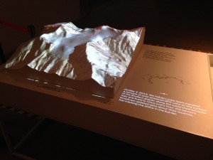
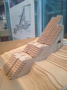
This alpine mountain range model (left) made using a CNC router worked fantastically when OS maps were projected on the the model from directly above. the contouring matched perfectly and appeared almost hologram like in front of the viewer.

Russia – In the Russian pavilion there was an interesting model on show that combined digital animation with a physical model. The basic walls and elevations of the model were built up out of plywood and overlaid on top of screens with animated environments of the proposed interior spaces (left).


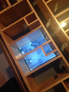
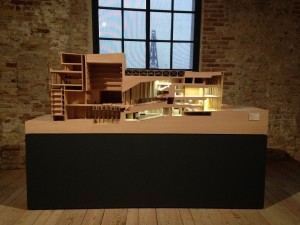
Turkey – There was a fantastic presentation cross section model of a theatre which was finished in veneer and full lighting (below). As is usually the case with models of this size they invite you to almost get inside the building and view different perspectives as you choose. This model was one of the best in show in terms of attention to detail and finish quality.

Japan – This display reminded me of a studio workspace with samples from different stages of the design process on display all over the room. Amongst the items were plaster casts (left) and perhaps interesting for our second and third year students at the moment, 1:1 structural details such as this fantastic timber joint detail below.


The main ‘Fundamentals of Architecture’ display by Rem Koolhass contained a fantastic array of different design and building components split it to groups and stages of production. One of the rooms featured a wide range of concept models from spiral stair cases (right). These were produced in different materials and at varied levels of finish but all as intriguing to see as each other.


The Hungarian Pavilion featured a number of great drawings and subsequent sketch models (left). These were made from a variety of materials and almost 100% using traditional analogue methods – that means no laser cutting guys!


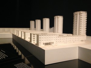
A huge part of the display in the French Pavilion looked at the tower block housing development called Cite De La Muette. The site was a modernist development that became synonymous with sadness after it was converted into a major internment camp for persecuted French Jews awaiting deportation during WW2.

The exhibition looked at the values and goals the development originally set out to achieve that were unfortunately very short lived. The center piece of the display was a white presentation model of the site with a romanticized film vision of modernist living projected behind (left).

Conceptual presentation model on display in the Costa Rican Pavilion (below)

I can’t say I’m a huge fan of the design but this Korean hotel model was finished to a high standard from beech veneer and timber (below). Very nice.

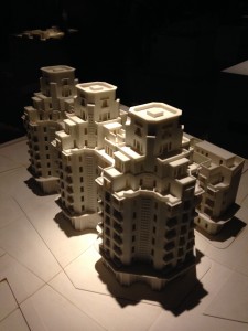
One of the 3d printed models from the Moroccan Pavilion display (below). A series of site models were displayed under spotlights in a sand filled dark room. Quite a strange experience to walk around.

Interestingly, despite its increasing prominence in people’s consciousness both professional and public, the use of 3D printing was thankfully kept to an appropriate level in most cases. I was particularly glad of this as the repeated use of this method of model production can become somewhat boring!

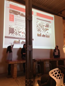
As well as the endless exploring of exhibitions across Venice the visiting students did manage to get a tutorial or two in and a presentation session of their proposed ideas.

The show was a fantastic display and I would encourage anyone to visit and see as much of it as possible next time around. The city is, without really needing to say, a fantastic inspiration and learning experience in itself.

Scott

Venice Arsenale Site Model, Matt Arnold

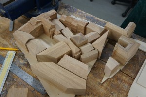
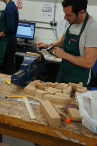
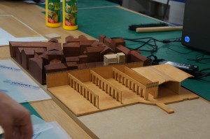
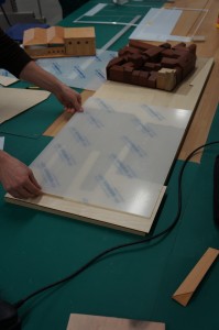
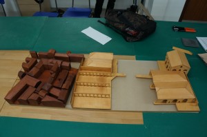
Matt used stained Meranti hardwood to create the block massing on his model. The majority of the model was hand finished to a high standard with time being taken to sand the blocks a smooth finish. The water in the Arsenale basin is represented with a sheet of frosted acrylic.

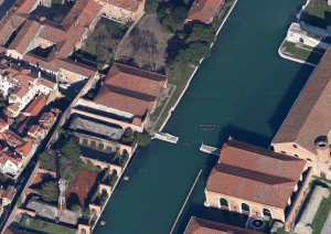
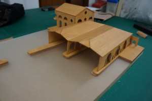
The site itself covers the Venice Arsenale and focusses around a small site, as is often the case with Venice, in between a restrictively protected mass of existing historic buildings. Matt intends to use the model as a master to ‘drop in’ his site proposals as they develop with the final model being displayed in place at the end of year exhibition.