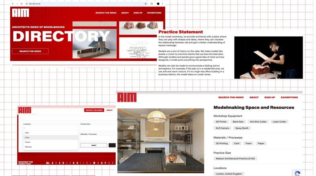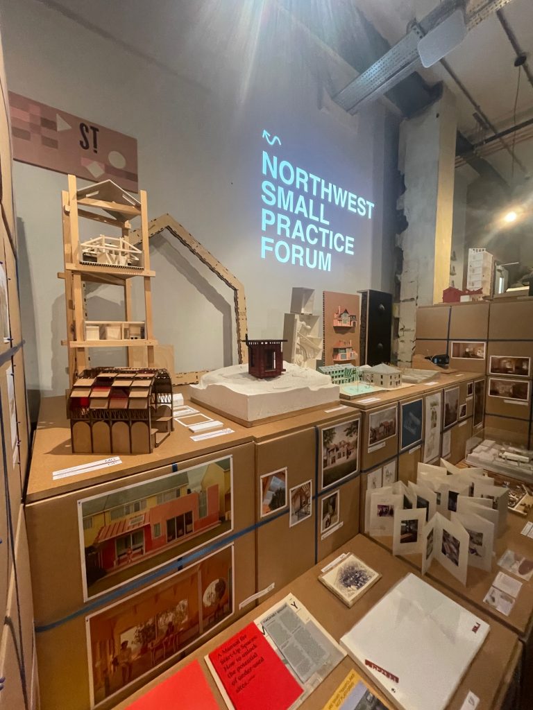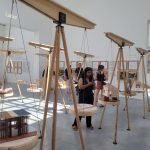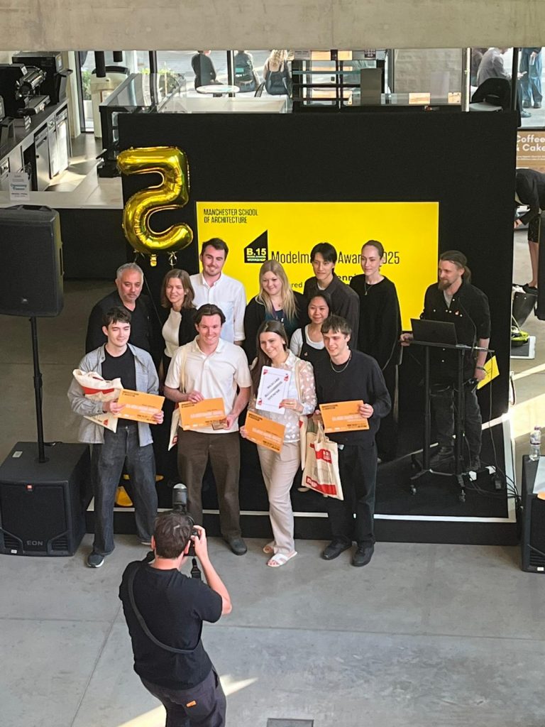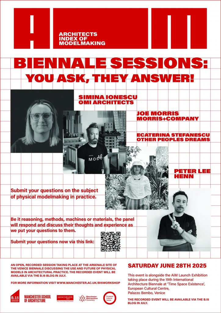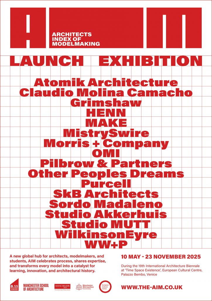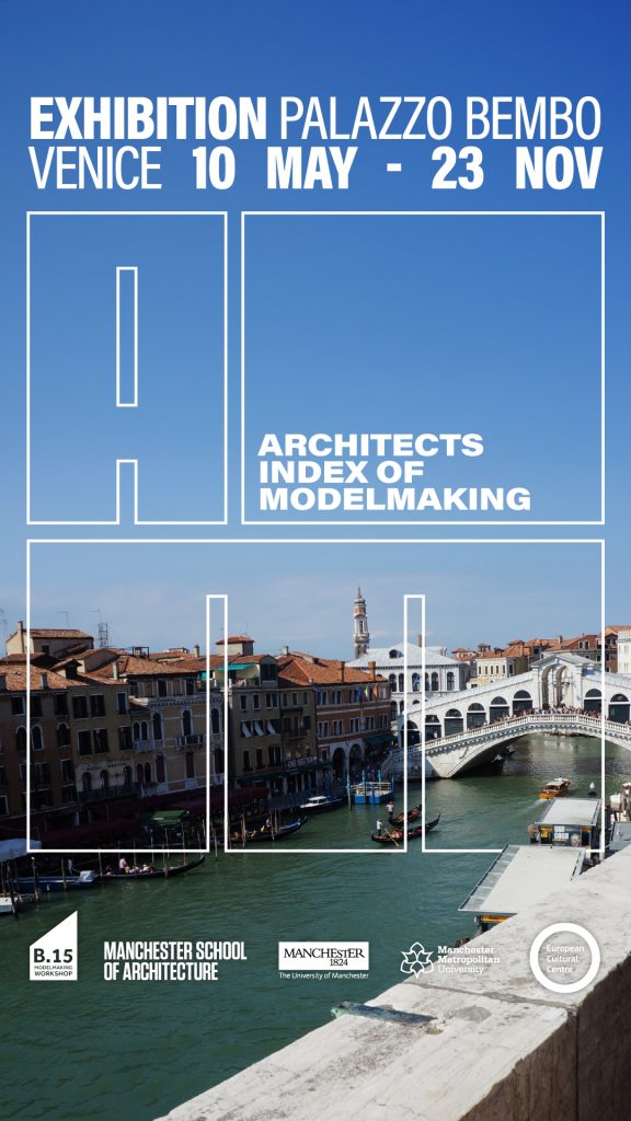
We’re pleased to announce this upcoming panel event in association with the AiM launch exhibition at this years Venice Biennale. Panel members who have contributed to the AiM project will respond to your questions on the subject of physical modelmaking in architecture.
At a time when we’re bombarded with news of artificial intelligence as the future in all walks of life, what does the production of physical models have to offer students and architectural professionals?
To get insight into your thoughts on this and anything relating to modelmaking in practice we are putting your questions to our panel in a recorded event that will take place on Saturday June 25th at 15.00-17.00 at the Venice Biennale Arsenale.
The event is open to all so if you happen to be in Venice do drop by and get in touch for more information. If you can’t make it the event will be recorded and we’ll answer as many of the submitted questions as possible.
WE NEED YOUR QUESTIONS!
We’re inviting questions from anyone, students, academics, professionals or anyone else with an interest. Ask the panel their views and we’ll discuss your topics live whilst being recorded for release here on our blog at a later date.
>>>>>>>>>Click here to submit your questions for the panel now!<<<<<<<<<<<
Meet the panel:

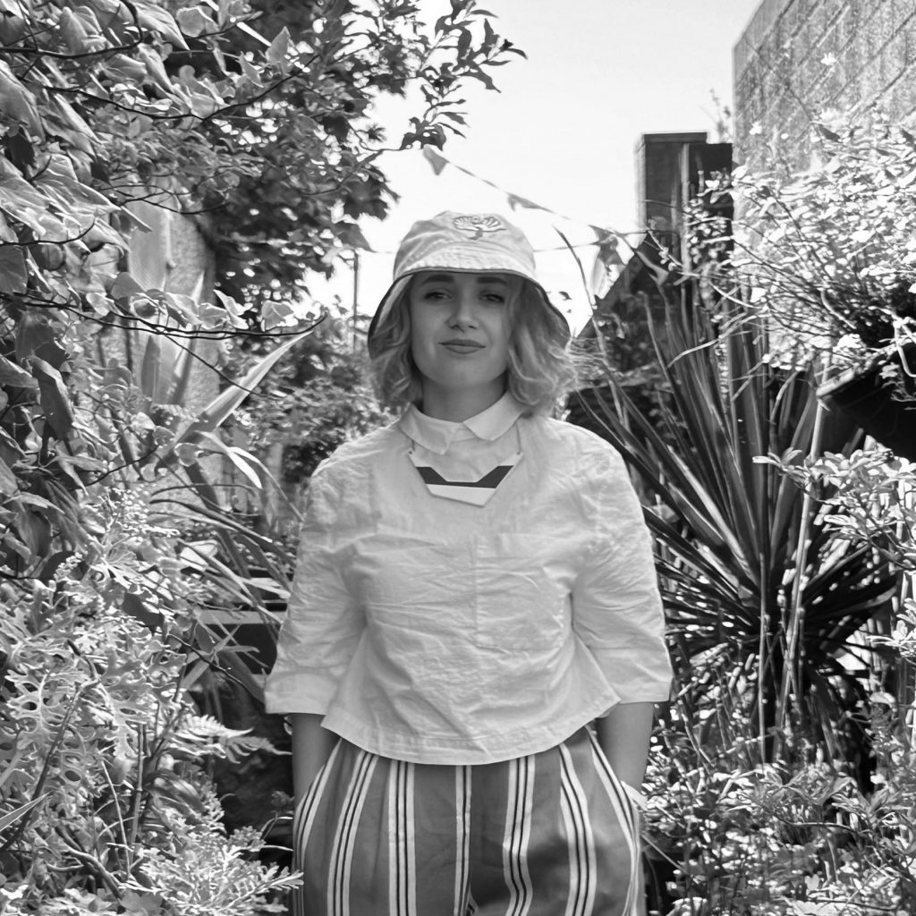
Simina Ionescu, Architect at OMI Architects, Manchester
Simina Ionescu is a qualified architect with over 11 years’ experience in the industry. After graduating from Manchester School of Architecture, she worked at several award-winning practices across Manchester before joining OMI Architects. Her experience ranges from heritage and conservation projects to new-build developments across the community, residential and commercial sectors. She is a strong advocate for model making as part of the design process and has helped implement the introduction of in-house rapid prototyping at the past three practices she has worked at.
OMI is one of the leading design-led architecture practices in the Northwest of England. The team of architects are all based in a RIBA Award-winning conversion of a Victorian baths, where they have created a number of studios for the creative industries. They are a multi-award-winning RIBA Chartered Practice and a certified B Corp. The practice is known for a broad range of work across all sectors, many of which are within sensitive historic settings.
Outside of OMI, Simina is a guest lecturer on the MA Adaptive Reuse course at the Manchester School of Architecture and plays an active role in the architectural community as the Treasurer of the Manchester Society of Architects.

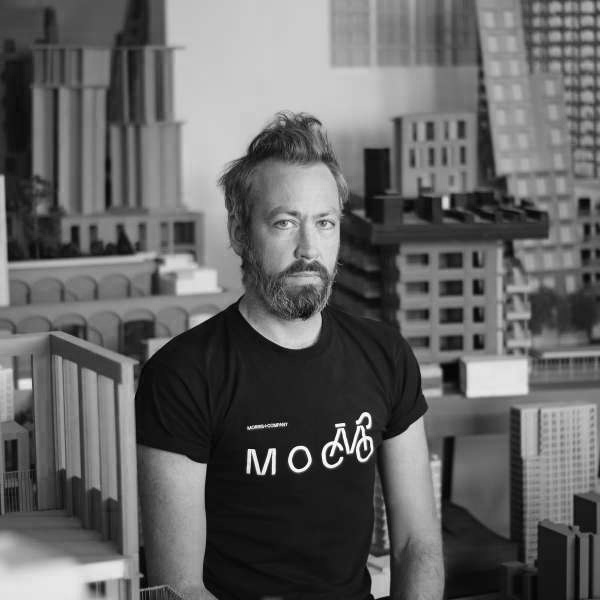
Joe Morris, Founding Director of Morris+Company, London & Copenhagen
Joe is the Founding Director of Morris+Company and spearheads the practice across its two studios in London (63 people) and Copenhagen (7 people). In a career spanning over 25 years of professional practice, which has achieved widespread international recognition, Joe has increasingly advocated a sense of urgency for fair and transparent practice, inclusivity and equality, through open dialogue and critical debate. He is increasingly vocal on environmental and social and governance issues and is the driving force behind MoCo’s ongoing journey to BCORP accreditation.
Models at MoCo are more than mere representations; they are an immersive, tactile medium for reflection, innovation, and abstraction. As Joe describes, they are simultaneously “reflection, experiment, innovation, representation, abstraction, communication, question, answer, success, and failure.” This multifaceted role imbues them with immense physical and conceptual value, a body of thought that embodies the cultural essence of MoCo’s practice.
Joe has rich experience of different types of clients, across both the public and private sectors and is accustomed to working at a range of scales. He has lectured on the work of the practice in many leading UK universities, as well as in Barcelona, Bilbao, Buenos Aires, Copenhagen, Hamburg, Liege and Romania.

Ecaterina Stefanescu, Other Peoples Dreams, Preston
Ecaterina Stefanescu is a Romanian artist, designer, researcher, and academic. She holds a Master’s in Architecture from TU Delft and is currently based in Preston, UK, where she teaches architecture at the Grenfell-Baines Institute of Architecture, University of Central Lancashire. Her artistic and research practice centres on modelmaking, live-build, and drawing as tools for exploration, investigation, and co-design.
Through what she calls ethnographic modelmaking, Ecaterina uses models to reveal what is often ‘unseen’ in the fields of design and architecture: everyday life as experienced by everyday people. Her approach is participatory, situated, and co-produced. Whether created with machines such as laser cutter or crafted by hand on site with participants from recycled materials, the model becomes a tool for representation, analysis, cultural expression, and community engagement. Ecaterina is also co-founder of Estudio ESSE, a design practice with work across Europe.
Other People’s Dreams is a live-action research studio based at the University of Lancashire. OPD utilises active participation and co-production with marginal communities in the north-west to conceive and create architectural and spatial interventions. These projects allow local people to test new possibilities, activities and infrastructures within the places that they live, work and play, leading to greater agency, autonomy and empowerment.

Peter Lee, Associate at HENN, Berlin
Peter Lee is an associate in the design studio at HENN, where he has worked for the past eight years across the Berlin, Beijing, and Munich offices. Starting his career as a model-making intern, he now leads teams on early phase work such as competitions and feasibility studies, with a focus on science and research projects, as well as experience in commercial, educational and cultural work.
HENN is a third-generation architecture studio with over 70 years of experience, with offices in Berlin, Munich, Beijing and Shanghai. HENN has completed more than 150 projects and counts 400 team members from more than 40 nations. As a general planner, HENN works on projects involving architecture, urbanism and master planning across all project stages.
A passionate advocate for model making, Peter is especially interested in the role of the physical model as a design tool, and how it can complement digital or computational methods of practice. His expertise ranges from creating rough sketch models to high-quality presentation pieces for competition submissions, clients, and press events.
Alongside his work at HENN, Peter is an external lecturer at Berlin International University of Applied Sciences, where he runs design modules as part of the undergraduate architecture programme.
>>>>>>>>>Click here to submit your questions for the panel now!<<<<<<<<<<<

