Venice Biennale 2014

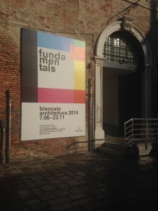
By now there have been hundreds of on-line reviews of the Venice Biennale which is this year focused around Architecture. The Venice Biennale is an annual event that showcases the creative arts from across the globe. Having been open since the start of June this year, the show is almost coming to its end having seen thousands of interested visitors of all backgrounds. My visit last week coincided with the 5th year study trip which basically allowed students free reign over the site and city.

My interest on the site is of course about the varied use of models. There was certainly no shortage of examples. Each international pavilion display addressed their own study of architectural fundamentals and the use of models played a regular and prominent role. As there were so many examples I will summarize my visit by including images of the examples on show and pay particular attention to contemporary methods of display which noticeably inspired many of the students I was with.

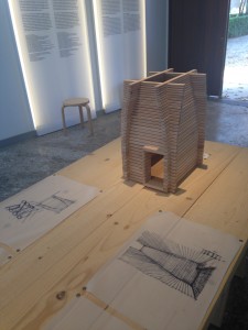
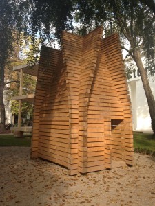
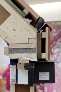
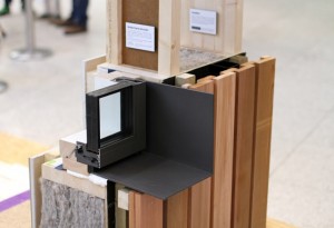
Finland – This pavilion was curated in a clear a concise way that explained the concepts in drawings, writing, models and the full size buildings on display outside of the main space. This method of display for the project was great and makes for easy understanding by any visitor. It’s probably worth taking note of this narrative when thinking about the display or presentation of your own projects.


The use of timber pieces accurately cut for the model (above) translated directly into the construction of the 1:1 construction (right).


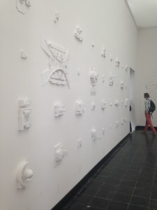
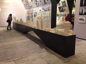
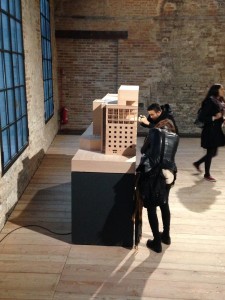
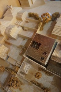
Austria – Now as popular as they are amongst established architects I’ve never been a huge fan of the ‘White Model’. I’m not sure why but I suppose it feels like a stark and almost clinical representation of a form which in reality has much more texture and thought behind its finish. That said, I’ve made many of these for clients and of course pursue the whitest of white finish to meet their brief. The Austrian pavilion presented a bright white room dotted with white block models of every one of the worlds parliament buildings (above left and below). I thought it was fantastic and enticing as did so many other visitors who spent a substantial amount of time examining the many models on display. This was an interesting subject matter to study in model form due to the ‘god’ like decisions that come from each of these buildings across the globe. One of my favourite displays of the show.

Projection Models – There was a noticeable buzz around the use of projectors to animate aspects of otherwise static models from the students I was with. Whilst this is something we have looked into before there were several good examples used across the Biennale.
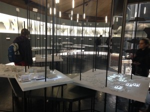
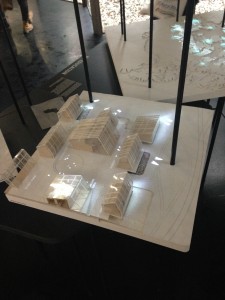
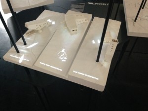
The Canadian pavilion made extensive use of the projection model with micro projectors mounted above white site models. Each model showed traffic flow trends and potential variants in the environment around the site. Anyone wanting to attempt a similar project should start by looking at the type of projector you want to use as they can be expensive and planning their set up in relation to the model is crucial.


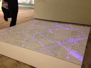
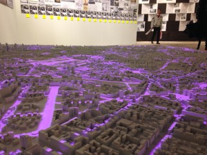
The Italian pavilion made use of a similar projection set up but was across a master plan model showing city routes toward and around particular hubs of activity.


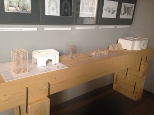
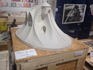
Also on display in the Italian Pavilion was a host of plaster cast models (right) each with a high level of finish and detail that guaranteed a closer inspection from anyone who walked into the room.


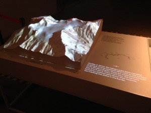
This alpine mountain range model (left) made using a CNC router worked fantastically when OS maps were projected on the the model from directly above. the contouring matched perfectly and appeared almost hologram like in front of the viewer.

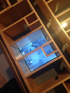
Russia – In the Russian pavilion there was an interesting model on show that combined digital animation with a physical model. The basic walls and elevations of the model were built up out of plywood and overlaid on top of screens with animated environments of the proposed interior spaces (left).


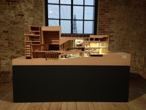
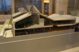
Turkey – There was a fantastic presentation cross section model of a theatre which was finished in veneer and full lighting (below). As is usually the case with models of this size they invite you to almost get inside the building and view different perspectives as you choose. This model was one of the best in show in terms of attention to detail and finish quality.
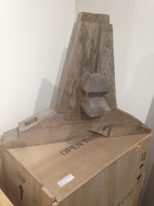
Japan – This display reminded me of a studio workspace with samples from different stages of the design process on display all over the room. Amongst the items were plaster casts (left) and perhaps interesting for our second and third year students at the moment, 1:1 structural details such as this fantastic timber joint detail below.
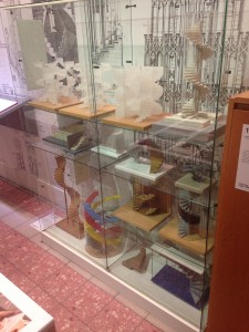
 

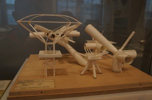
The main ‘Fundamentals of Architecture’ display by Rem Koolhass contained a fantastic array of different design and building components split it to groups and stages of production. One of the rooms featured a wide range of concept models from spiral stair cases (right). These were produced in different materials and at varied levels of finish but all as intriguing to see as each other.


The Hungarian Pavilion featured a number of great drawings and subsequent sketch models (left). These were made from a variety of materials and almost 100% using traditional analogue methods – that means no laser cutting guys!
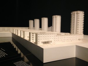


A huge part of the display in the French Pavilion looked at the tower block housing development called Cite De La Muette. The site was a modernist development that became synonymous with sadness after it was converted into a major internment camp for persecuted French Jews awaiting deportation during WW2.

The exhibition looked at the values and goals the development originally set out to achieve that were unfortunately very short lived. The center piece of the display was a white presentation model of the site with a romanticized film vision of modernist living projected behind (left).

Conceptual presentation model on display in the Costa Rican Pavilion (below)
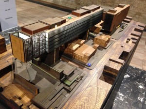
I can’t say I’m a huge fan of the design but this Korean hotel model was finished to a high standard from beech veneer and timber (below). Very nice.
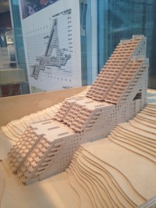
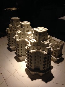
One of the 3d printed models from the Moroccan Pavilion display (below). A series of site models were displayed under spotlights in a sand filled dark room. Quite a strange experience to walk around.

Interestingly, despite its increasing prominence in people’s consciousness both professional and public, the use of 3D printing was thankfully kept to an appropriate level in most cases. I was particularly glad of this as the repeated use of this method of model production can become somewhat boring!
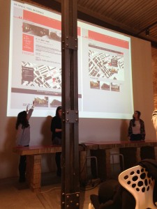
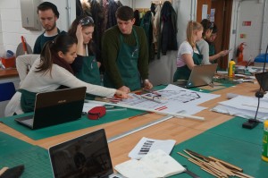
As well as the endless exploring of exhibitions across Venice the visiting students did manage to get a tutorial or two in and a presentation session of their proposed ideas.

The show was a fantastic display and I would encourage anyone to visit and see as much of it as possible next time around. The city is, without really needing to say, a fantastic inspiration and learning experience in itself.

Scott

‘Testing The Machines Of A Third Industrial Revolution’ Cross Section Presentation Model, Abhi Chauhan

Abhi (33)

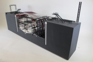
This project was completed in the final weeks of the last academic year by 6th year MA Student Abhi Chauhan. The project is the follow on to the 1:100 section we featured several months back. What is particularly appropriate about the styling of this project is the subject matter or the site. Being a 3D Printing Manufacturing facility of the future means no better method of production that the technology in question. This is definitely something to consider when devoting yourself to a major project like this – for example, if you are building an eco-concious design then that ethic should carry through to your presentation and thus model construction. This project sticks to its purpose through and through.

Abhi has been since graduated and started a full time position at Grimshaws in London. We wish him all the best in his future career!

IMG_4753

This piece will be on display as part of our B.15:45 Exhibition so be sure to have a look in person.

Abhi has kindly written us this extensive account of the theory and construction methods he used in this stunning final piece. Enjoy!

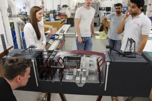
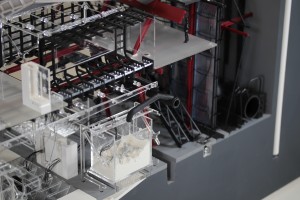
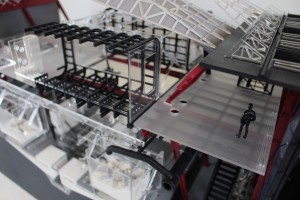
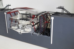
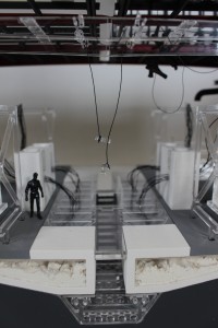
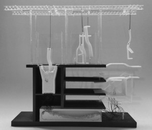
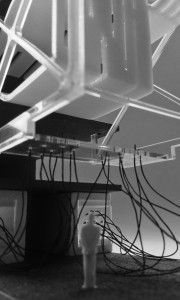
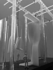
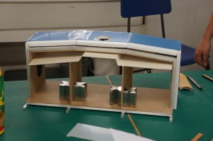
This model is a final exhibition 1:50 sectional model. The slice is located through a key component of the building scheme titled ‘The Machines Of A Third Industrial Revolution’ The model slice – in detail depicts the processes of 3d printing of 1:1 architectural components, to be tested on a stalled concrete frame bounding the site. The design of the facility is such that it sits into a trench in the ground and features a folded roof structure which integrates a 3d printed park at ground level with the industrial processes of the facility within. The scale of the facility has been designed to be oversized, to deal with the variety of large scales that are needed in the manufacture of components for the construction industry.

The model builds upon the 1:100 sectional model completed earlier this year, and takes on a similar aesthetic to that of a cross section through a large industrial machine hanging of the walls of the facility.

The model has been constructed with a variety of different techniques.

IMG_1003

The base has been CNC cut from x15 18mm mdf sheets layered and glued together. This method, although not the most cost effective meant that each layer of the base could be designed to incorporate slots and grooves within for housing of the various components that would eventually complete the model.

Abi (10)

2

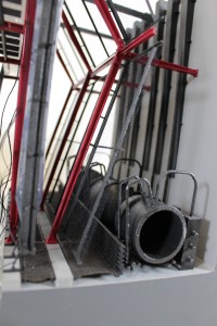
The red structural parts forming the portal steel frame structure hung within the trench were all constructed in 3ds max and then 3d printed on the ABS printer. These parts were then spray-painted to get the final red finish seen. Other components that were printed, include some of the facade components, and the series of storage tanks and pipes to the right of the trench. This method of manufacture was chosen sue to the time constraints, the subject matter of the project, and the complex shape of some of the parts.

IMG_1016

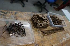
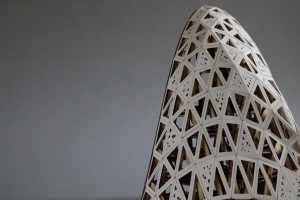
The roof was also 3d printed and a shelling script in grasshopper gave the folded structure a thickness to make watertight for 3d printing. This part was the most challenging to construct and after a variety of failed tests the part was printed at Hobs due to their larger printer beds (up to 1500mm wide) which allowed for the part to be printed as one component. Finishing the roof are a series of card panels (depicting a metal skin) which were laser cut and engraved. These were bonded to the 3d printed structural roof frame using spray mount.

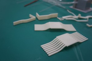
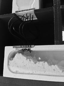
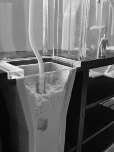
The material archives (in white) set into the base of the model were the last parts to be 3d printed on the model, and were done on the powder 3d printers. These constructs were notoriously fragile and once installed in the base had their edges and portions of their rebuilt in white pollyfilla.

The remaining components making up the model have been formed from either 2 or 3mm clear acyclic. For example the 3d printers on the -2 level have been laser cut form a mixture of 2 and 3mm acrylic and then assembled to snap fit and slot together to avoid gluing. This clear aesthetic was chosen for a variety of the model parts as can be seen.

Abhi Components

The landscaped elements including the cranes and gantry and the main internal staircase were all laser cut from 2mm mdf. These part were all spray painted to the final grey and black finish shown.
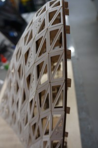
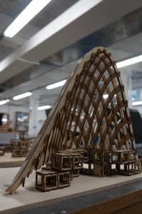
The facade skin (resembling an ETFE system) was vacuum formed over a 3d printed mould. The mould was designed with groves in it and as such were expressed in the final plastic shells.

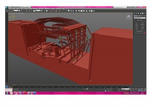
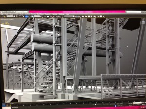
Before any parts were manufactured every part was modelled in 3d and then assembled to create a master digital model. (see image) Due to the large amount of parts on this model this was necessary to eliminate any unforeseen mistakes which would be harder to rectify once parts had already been cut.

IMG_1046

Each part of the model was treated as a mini project i.e. the main facade, the main stair case, the 3d printers on the ground floor, etc. Once these were all assembled and sprayed the whole model was put together like a giant jigsaw. Due to the fact that almost every part was digitally fabricated there were few tolerance errors during final assembly.

The model took approximately 3 weeks to translate from an actual section into model drawings and then 3 weeks to get all the parts cut and painted and a final week to assemble together.

Abhi (6) Abhi (49)

Abhi (55) Abhi (2) Abhi (66)


A reimagining of slums , QED, Alexandr Valakh Part 2

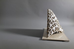
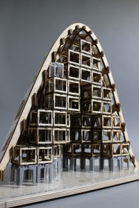
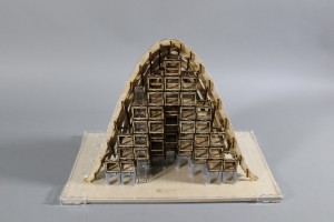
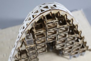
Back in March we looked at Alex’s 1:100 model exploring the assembly of his proposed site. Alex completed his model series by producing a 3D printed site model and finally a cross section model showing the relationship between the individual units and the optional outer skin facade.

Alex 3d Print (1)

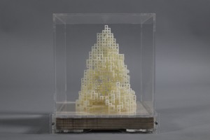
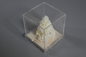
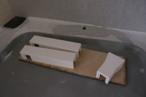
After several days in the chemical bath to remove support material Alex placed his 3D printed model in a purpose made display case to protect it from intrigued hands! It’s always worth noting that forms such as this require a lot of support material when made on the ABS plastic printer which often means extended periods of time post-printing in the chemical bath.Alex 3d Print (20)
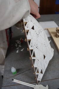
Alex final Project (4) Alex final Project (11) Alex final Project (15) Alex final Project (18)The outer skin of the model was made using paper components that were CAD designed and laser cut before being hand assembled. The completed skin was fixed onto the plywood frame carefully using superglue.
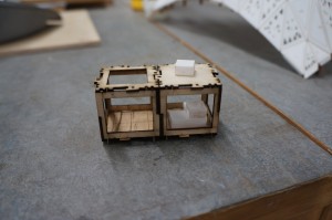
Alex final Project (20) Alex final Project (21) Mass produced standardised components were designed to be quickly assembled to create the form much like the full scale proposal offers. Alex final Project (23) Alex Final Major Section (1)Alex Final Major Section (3)Alex Final Major Section (6)Alex Final Major Section (13)Alex Final Major Section (43)Alex Final Major Section (74)Alex has produced some fantastic models here over the last two years and we encourage everyone to look at this level of work for inspiration. All the best for the future Alex!

Alex final Project (8)

Abhi Chauhan: ‘Testing the Machines of a Third Industrial Revolution’ 1:100 Site Section Model

6th Year MArch student Abhi Chauhan has recently completed several models as part of his Intimate Cities project. The earlier models were used to demonstrate initial concept ideas and helped influence design changes. In keeping with the subject matter of the proposed development Abhi has put heavy emphasis on digital manufacture.

Abhi gives us an over view of the project and how this model fit in to its development:

As part of the Intimate Cities Atelier this year we were concerned stalled construction sites in the city of Manchester. These sites are unique in that their infrastructural order has been partially installed and my primary aim is the reconnection of these sites back to the city context. Situated on the Potato Wharf stalled construction site, the final scheme looks at the idea of bringing around a Third Industrial Revolution, by looking at the research and testing of an advanced manufacturing technique (3d printing) and a new energy infrastructure, (hydrogen fuel cells).

 Realised as a masterplanning strategy the stalled concrete frame on the Potato Wharf site is used a ‘live’ test-bed for 3d printed architectural components, in addition to this the scheme engages with the redundant  transport infrastructure bounding the site and reinstates the canal and rail network as a distribution matrix for the transport of raw material. A reconfigurable 3d printed public park defines the edges of the new site in the overall strategy.

VISUAL LIGHT

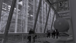
The renders depict how the main 3d printing manufacturing hall and hydrogen exchange will look. The 3d printing facility is concerned with the research, manufacture and testing of 3d printed architectural components and as such the construction and detail is oversized to deal with a variety of different scales present on this project.

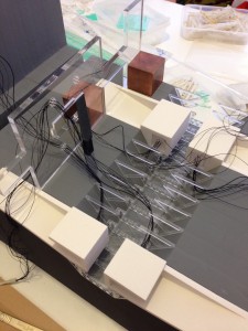
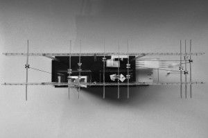
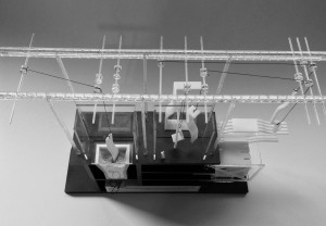
This first conceptual model depicts the main processes occurring in the 3d printing facility and follows the life-cycle of a 3d printed architectural component from its raw powdered state – stored in a material archive; to the printer beds; then for reconfiguration in a graveyard of failed components; and ultimately to its reverse engineering back to its raw powdered state.

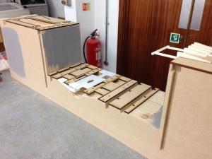
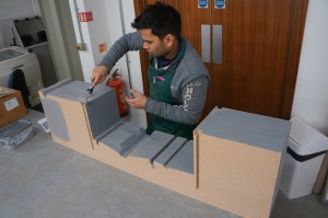
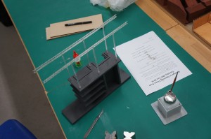
The main frame was laser cut from 6mm MDF and designed to slot together. After spray painting grey to depict a raw concrete surface a series of powder printed material stores were fixed in place. It was decided to 3d print these stores due to their complex shape and the desired ‘layered’ construction aesthetic I was after.

The main machines in the model have all been constructed from separated components each laser cut from 2 and 3mm clear acrylic.

The 3d printed architectural components created in the facility were depicted by themselves being 3d printed. These parts were modelled in 3ds max and made ‘watertight’ ultimately for 3d printing on the ABS printer. (Abhi Chauhan May 2014)

Abi (2) Abi (5)Abi (6)

Abi (7)

One aspect of Abhi’s model work which is particularly successful is the appropriate use of different process. Having an understanding of the best suited method to achieve a desired outcome is key to an effective model. Without a clear aim as to what it is you are trying to convey many models have little practical use in conveying the key aspects of a design concept. This model of course naturally lends itself to 3d printing due to the subject matter.

IMG_0740 IMG_0744 IMG_0750 IMG_0752 IMG_0753 IMG_0757 IMG_0758

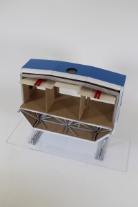
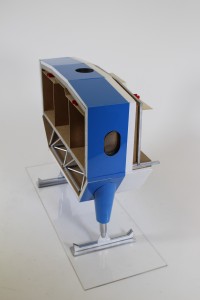
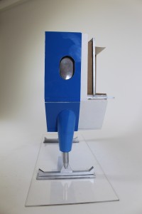
2nd Year 1:20 Detail Section ‘Halley 6’ Project

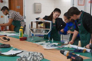
Second year groups were asked to produce a 1:20 detailed section model of their construction pack which was provided by another group in the year. The objective of the project was to use the model to demonstrate their understanding of the buildings construction in terms of its technical details, services and environmental performance.

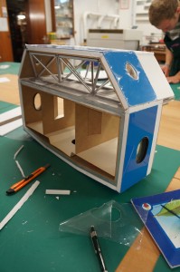
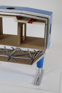
This groups building, known as ‘Halley 6’ is the British Antarctica research station. The chosen section featured two supporting legs and look at internal structural elements in relation to the outer facade as well as ducting voids.

The submission was given in alongside a report including a 3D Digital structural model that also showed the main structural components.

The model was made using plastic tubing for structural space frame components, vac forming plastic sheets to form the leg supports and clad the exterior. In order to make the leg shape a former was made to wrap the plastic around which was heated and glued into shape. The leg assembly and skis were represented with laser cut elements that were spray painted. Flooring and interior walls were made using 3mm MDF.

Andra Calin Group. Halley 6 project (3)

Extension to the Academy of Fine Arts, Venice, Benjamin Hale

This project seemed to go on forever but Ben got there in the end after much thought and perseverance! Ben described the project in his own words for us:

“The project centred around the concepts of subtractive architectural restoration, revealing existing elements on site and adding additional elements to solve architectural anomalies often found in historical cities such as this.  The models represent at differing scales how the site interacts with this new architecture as well as how my own building functioned within the new public spaces created by this subtraction. Many of the models are abstract forms of more sophisticated concepts yet the message remains concise as to what each model is trying to achieve by the way of simplifying the material pallet and not resorting to complicated methods. The models are also interchangeable as long as they are created at the same scale and can be reused to create new models later on or explain an idea in greater detail. Model making is an integral part of any designer’s toolbox and new techniques should be tested, however often you can find that a new take on a tried and tested method will result in unexpected outcomes that will further you design.”

This series of models certainly give a varied view of Bens proposed project which is exactly what you should be trying to achieve in your submissions. Models are there to convey different aspects of your design in the best possible way. Spending time to think about exactly what you want to show and how best to show it is time well spent as frustrating as it can be at times!

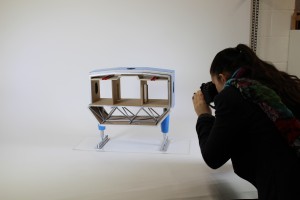
Also, as a side note to you all, unless you plan to take your array of models with you to interviews etc. then good photography is essential to document your work. We will be looking to a devoted photography area of the workshop in the coming months in time for the start of your new term in September.

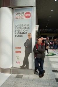
Grand Designs Live, ExCel, London

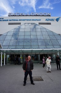
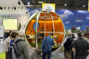
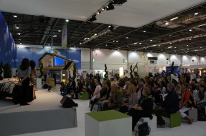
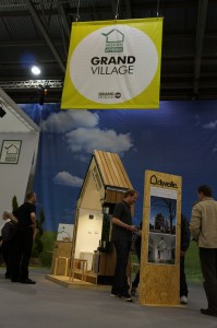
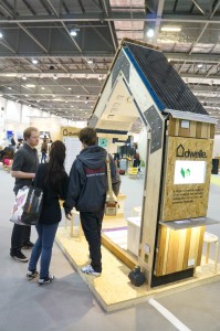
Yesterday myself and Jim travelled down to London to visit the Grand Designs Live show at ExCel. The show presents hundreds of suppliers from various design industries inspired by the hit TV series. Of particular interest to us was the use of models as sales pieces for show participants. This was not limited to scaled down architectural pieces but full size 1:1 constructions and prototype details. Throughout the day we were able to meet a variety of people and spread the word about the workshop, this blog and the courses we are involved with here in Manchester.

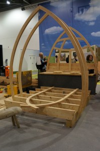
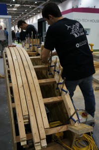
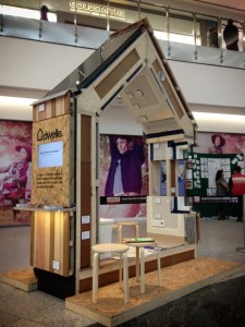
Several weeks ago we posted about the dwelle project that was completed in the workshop. This project was and continues to be very successful for dwelle in demonstrating the construction behind their eco house design. The model made a starring appearance at the show next to the Grand Theatre which hosts many design related lectures over 10 days.

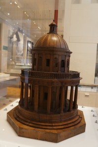
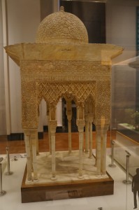
As well as visiting ExCel we stopped by at the V & A to have a quick look at their Architecture gallery. The gallery features a good selection of model types and styles and is well worth a visit if you are in the area.

1:100 section model of a distribution/retail centre in Bradford, Sam Higgins

Sam Higgins 2

To further convey the detail within the Site as shown in Sam’s 1:500 site model, this model takes a section of one of the buildings to focus on. By using a ‘cut through’ approach at 1:100 the viewer is able to better understand the complexity or layout of a building’s construction that is not put across in models of a smaller scale.

Sam Higgins 3DSC00217

Sam used a variety of materials and techniques to create this cross section but of most importance to note is that it was largely hand crafted and assembled. Whilst CAD based machines can greatly benefit the construction of elements of your models they are best used as additional tools for making rather than the sole producer of your models.

This model used laser cut parts to great effect such as the window frames and shelving units which, if done by hand would come at great cost in terms of your time. Time spent drawing accurate components for other flat elements of this model, is far better spent simply hand cutting them. This is also a lot cheaper! Use machines appropriately – ask a member of staff when deciding how to construct your model for their take on the best approach.

DSC00195 DSC00198

Cross Sectional Bridge Model, East Croydon Pedestrian and Cycle Bridge, Charlie Kentish

CharlieKentish1

This 1:50 scale cross section model used laser cut cardboard for the supporting structure and 3D Powder Printing for the parametric roof design. The roof section was created digitally using Grasshopper. The project was commended by the Manchester Society of Architects in the design awards for 2012.

CharlieKentish5CharlieKentish3 CharlieKentish4

Dwelle Project

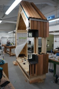
Some of you will be familiar with the Dwelle project by Manchester based Architect Ric Frankland. The eco home project has been on going for several years with this year taking things to another level thanks to the half scale cross section model built in our workshop! The model was built over 2 weeks and gave students and first-hand insight into the full scale construction of these contemporary Eco homes.

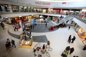
The project has gone on to be displayed at events at Manchester’s Bridgewater Hall and the Manchester Arndale and will continue to travel further afield in the next month… stay tuned for more on this!