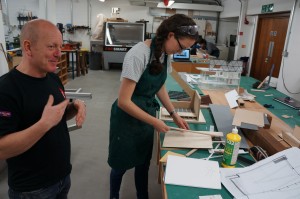
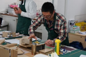
In continuation of our individual extended interviews on modelmaking for B.15:45 here is Principal Lecturer Sally Stone talking about the uses of models in her Atelier, Continuity in Architecture.
Monthly Archives: May 2015
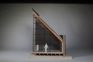
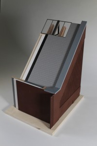
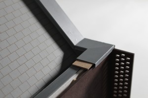
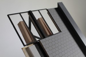
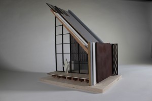
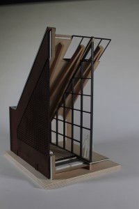
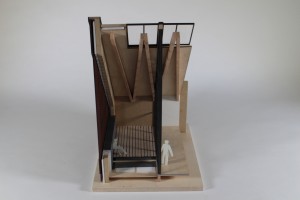
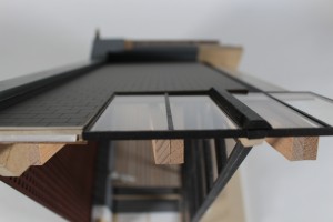
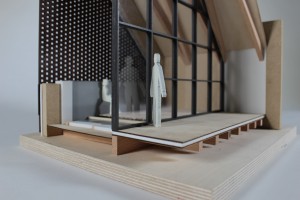
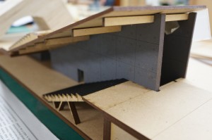
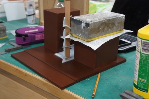
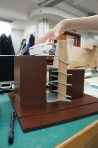
‘Wood Street Mission’ 1:20 Section Model by Katie Williams
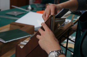
Year 6 MArch student Katie Williams wrote about her final major modelmaking project for us:
This project is successful as it carefully balances necessary detail with material choices. The scale of 1:20 is perfect given the amount of layered detail Katie chose to show in her construction and the choice of this corner section was well considered as it shows a good selection of details and finishes that would expand throughout her whole design but are not necessarily required in their entirety to understand their application.
The success of this project is largely down to planning and material awareness. Rather than making the medium her binding constraint and only working around a particular tool, Katie rightly chose to dissect her model into components to help her understand its form as well as considering the most appropriate method of manufacture to represent each part.
It is clear is how well Katie understands the assembly of her building and the lessons learned in making this presentation model no doubt only strengthen that.
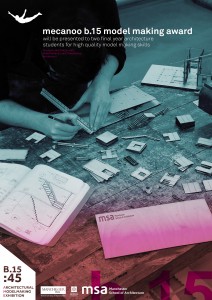
Mecanoo B.15 Modelmaking Award
We are very pleased to announce in conjunction with our 45th year celebrations a new award for outstanding modelmaking at MSA.
The award will be sponsored by award winning architects Mecanoo who have recently expanded their offices to include a new Manchester branch.
“Model making is integral to the design process at our headquarters in Delft and we place a great deal of value in students who can demonstrate a love for the physical crafting and communication of space in architecture, landscape architecture, and urban design.
As such, Mecanoo is proud to sponsor an award which recognises high quality model making skills at Manchester School of Architecture – a school in a city which has become our UK home. We hope that this prize will encourage final year students to push that little bit harder to make their models as experimental, pragmatic (and beautiful) as possible!”
Francesco Veenstra (partner in charge of UK projects)
The Awards
Representatives from Mecanoo will be in attendance and along with UoM and MSA staff will judge the winners.
In addition to the award for your portfolio, sponsorship from Mecanoo and ourselves will provide a cash prize of £500 per winner.
Models will be judged on their overall quality, choice of scale, material choices, chosen methods and the models effectiveness at conveying your design features.
We hope this gives you more of an incentive to think about your modelmaking skills and strive to improve on the great results we have already seen this year!
Good luck!
Jim and Scott at B.15
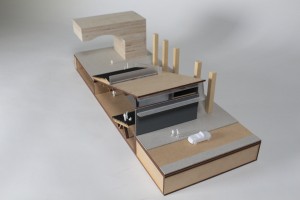
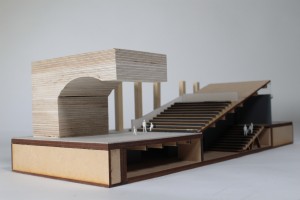
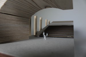
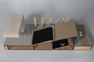
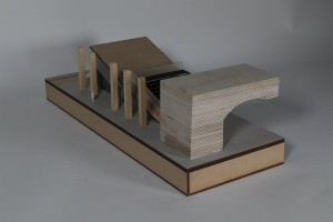
1:100 ‘Performance Centre’ Cross Section Model by Philip Lam
Philip Lam explains to us how he used his model to convey his ideas for increased space and performance capacity:
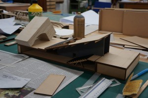 The material primarily used in my design is concrete. To mimic this in my model, I used laser cut MDF covered with spray painted sandpaper. Rather than making a mould and casting it, this was a quicker and more economical representation of the textural and structural qualities that were required. The half-arch was made using plywood blocks which were stuck together, cut and shaped using the band saw and bobbin sander. The grain in the plywood helped replicate brick and mortar. For the seating, I needed a material which is thin, yet strong enough to sit on the wooden support frames and decided on using mount board. Finally, I used laser cut frosted acrylic pieces to represent the translucent cladding found in my design.
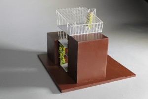
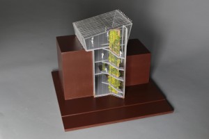
1:100 ‘Parasite’ Context Model by Anca Trimbaciu
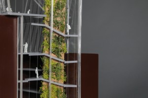
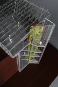
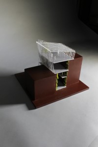
This case study by Anca Trimbaciu shows us her proposed building within its enclosed site context of two existing buildings. So as not to take the focus away from her design the massing of the context buildings was kept simple. Anca wrote down her thoughts on the project for us:
“As part of first year’s final project we had to go the extra mile in explaining our design and idea. Therefore, we had to create a presentation quality model. My entire year revolved around butterflies, that being the animal I chose, so my building was also connected to them, being an indoor butterfly garden, a space for recreation and relaxation.
My design is a parasite building in between other two existing ones, which covers a very small space and puts focus around the staircase and the idea of ascension. As you move up you gradually discover spaces that are more open and luminous until the last floor which allows a panoramic view of Oxford Road from the inside of a “green utopia”.
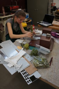 The model shows context, size and the purpose of my building. A section in the back of the model allows the viewer to see inside and observe how the building makes use of the adjacent existing buildings and how double volume appears during the ascension towards the top floor.
I used painted MDF for the adjacent buildings and the base of my model just to give an idea of their size and appearance, contrasting with my design through colour and texture. Other than that, the rest of my model is mostly made out of clear or grey acrylic as it was the best choice to either represent glass, metal or polished concrete. The triangular staircase is sustained by a wooden column which is covered in vegetation. Because the scale is only 1:100, I opted for showing ramps instead of creating each step out of acrylic.
During the making of this model I had my first attempt at using Autocad and laser cutting, and surprisingly, I succeeded. I learned how to spray paint in order to completely cover the texture of a material and I improved my skills in working with acrylic. I also got the chance to fully understand my building and its structure.
It has been two well spent weeks in the workshop and I am looking forward to my next project, even though starting a model might be scary at first, the results are most of the times really impressive and worth the time.”
The construction method for this model was well considered and, much like the building process of a 1:1 project, the order of assembly was orientated around the ‘core’ access, in this case stairs, providing support for the different levels.
Of particular merit here is the consideration to how the massing was created. Rather than being solid blocks, the context massing was made up by creating hollow boxes which were then coated with sanding sealer, sanded and painted. This method saves on material and overall weight of the model and can often be done for free with off-cut material.
Extended Workshop Opening Hours
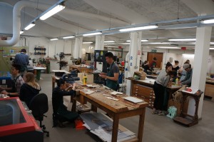 Due to high demand on the facility we have been able to agree later opening hours for a trial period of 3 weeks starting May 11th and ending May 28th.
The workshop will remain open Monday -Thursday until 19.30 when students will be asked to clean up your workspace as normal in preparation for the following day. These temporary opening times are as follows:
Monday 09.30 – 19.30
Tuesday 09.30 – 19.30
Wednesday 09.30 – 19.30
Thursday 09.30 – 19.30
Friday 09.30 – 16.30
This time is in addition to our normal working day (09.30 – 16.30) and therefore does not mean you should turn up any later than normal. If this period is found to be ineffective at reducing the stress on the facility it is unlikely we will be doing it again so please make the most of the time.
So far this year there have been some great models produced and we hope the next few weeks will see some more great results. Make the most of it!
Scott and Jim

