Architectural Modelmaking, Design Development, Bespoke Design & Construction. Part of The University of Manchester (SEED School of Environment, Education and Development) Part of the Manchester School of Architecture
Beginning Monday 25th January we will be hosting a 5th year workshop for the first part of each day meaning restricted access to all other years for these periods.
Opening times will be as follows:
Monday 25th – 13.00 – 16.30
Tuesday 26th 13.00 – 16.30
Wednesday 27th 13.00 – 16.30
Thursday 28th 09.30 – 16.30
Friday 29th 13.00 – 16.30
Monday 1st 14.00 – 16.30
Tuesday 2nd 13.00 – 16.30
Wednesday 3rd 13.00-16.30
Thursday 4th 13.00 – 16.30
Friday 5th 13.00 – 16.30
Monday 8th – 14.00 – 16.30
Normal Opening will resume from Tuesday 9th February.
“Designed in the 18th century by the artist Giovanni Battista Piranesi (1720-1778), Caffè degli Inglesi in Rome, just moments away from the Spanish Steps, is a prime example of a lost ‘cultural cafè’. Renowned for its eccentric Egyptian style, it was a main hub for British artists visiting the Eternal City. Although it was a key centre for culture and artistry, the café’s design divided opinion. Caffè Degli Inglesi only survived for circa 20 years.
Only two plates etched by Piranesi himself have survived that depict one long and one short internal wall. Because of this, our main challenge was re-imagining the space. As the cafè is long gone and we have no information in regards to the materials, colours, techniques employed, it therefore seems clear that the physical architecture of this space shouldn’t be our main focus, but capturing the lost atmosphere by trying to create a ‘shadow’ of the lost physical space.
When creating a three-dimensional model, it was obvious we needed to depict the two undocumented walls in a way that does not mimic nor assume, but can capture the spirit needed for the café’s re-interpretation. We are therefore suggesting the use of mirrored walls, providing an immersive experience, without compromising the integrity of Piranesi’s unknown original design.
The material choice for the rest of the model was intended to hint towards Piranesi himself’s original metallic plates. The time and expense required in producing real metal plates was soon deemed too unrealistic, therefore an innovative solution was found in aluminium powder mixed with resin to create a metallic, durable cast acrylic sheet. From these they were able to be handled by machines such as the laser cutter in creating the etchings on both sides.
A challenge came in the creation of the vaulted roof, where the material was heated following the etching process and formed around a pre-made mould. The 4 sheets were then filed so that the edges could align as best as possible. Assembly of the model involved super-glue, epoxy resin (made metallic in the same way as the cast sheets to match) and finishing using 3mm self-adhesive lead strips.
We were asked to display the model on a 400x400mm plinth. This was created with a number of feature to help enhance the model, for instance the plinth was created to be 1500mm high in order for the model to be viewed from eye level and allowed the viewer to experience the mirroring of the materials within. The rectangular shape of the model was then rationalised by creating a series of steps at the top of the square plinth, the final step incorporating a step down to fit the model so that the floor plate runs smoothly from outside to inside. The plinth was then painted in a matt white, with a shadow gap creating a neat finish between plinth and floor.” – Vanessa Torri & Daniel Kirkby 2015
Making the Model
For this project it was decided to make the wall thickness 3mm for ease of construction as well as keeping the material use to a minimum. Simple tray moulds were made up using strips of 3mm MDF that were double sided taped down to a base. This aids an easier removal from the mould once the cast has cured.
Note – if it is clear that a lot of the same component are require (in this case resin slabs) that it may be worth making the mould using a silicone to allow repeat casts and easy cast removal. As this project was very much ‘try it and see’ the required moulds were made as needed.
Once the basic mould was complete the surfaces were coated with a barrier coat of Vaseline to prevent the resin penetrating the surface of the MDF when poured.
Metal powders
The use of metal powders in casting allows us to create a lightweight and, when compared to full metal casting, low cost but effective substitute material. The process uses very fine metal powder to coat the surface of a desired cast that can then be polished as if it were cast in the metal in use. In this case Aluminium powder was chosen to emulate lead.
In order to guarantee a good coat of metal powder on the surface of casts the mould should be dusted with the desired powder. The excess powder can be poured from the mould and reused.
Mixing/Pouring Resin
For ease and speed of casting fast-cast- polyurethane resin was used as the stock material for the cast slabs. The resin is usually mixed at a 50/50 ratio but always check the instructions as some brands do vary their instructions on ratio mixing. As we were going for a metallic finish overall metal powder was also mixed into the resin to back up the surface coat already ducted into the mould. As the resin is poured the metal powder particles naturally want to sink to the lowest point so having them in the resin only increases or chances of a successful finish on the face of the cast.
Surface Finishing and Laser Engraving
Once the slabs have poured they can be carefully removed from the mould and all being well will have a dull but flat finish on the down face. Using wire wool the surface can be polished up to the desired shine.
Next up for this project was the engraving of the Piranesi drawings onto the plates. Using the laser cutters Daniel and Vanessa were able to engrave into the polished surface of the plates as well as the back face which would end up being inside the model.
The roof components required heat forming to create its vaulted shape. This shaping occurred after being engraved and cut to shape which required significant time to figure out correctly.
The final detail to be added to the model was lead finishing strip as used on leaded windows. As well as finishing the panel gaps this strip. lent itself to the model design and matched the metallic finish perfectly.
The model will be on display as part of the 5th year ‘Lost Spaces’ workshop display at the end of year show in June.
Hope you have had a good break and time to recoup for the next few months.
Part of the UoM server went down over the break resulting in our blog going down but thankfully everything is intact and we are back online. Apologies for any inconvenience this caused anyone.
****Workshop Opening Times January/February****
This year we will be hosting one of the 5th year workshops between 25th January and Monday 8th February.
This will mean a shorter working day for these two weeks with the workshop only opening from 11.00 till the normal closing time of 16.30.
New Materials
We have a couple of new additions to our materials stock this term which as usual are subject to availability so be sure to check before beginning your project planning
Finnboard
Anyone who has been inducted this year or last will have been told about this product which 4D Stock. This pulp board has a great range of applications due to its ability to form shapes when wet which are maintained when the board dries. Recommended for sketch and development models but there’s no reason it couldn’t be used for more advanced models as well.
Metal Effect Silver Styrene Sheet
One of the most common questions asked of what can be cut on the laser cutters is metals. Whilst this isn’t possible we have bought in this substitute which is a metallic styrene plastic sheet. This can be laser cut and worked as with other styrene or acrylic sheeting and should serve as a suitable alternative for some cases.
Scale Trees
We have a small selection of high quality brass etched and flocked scale trees. These are available from 4D Modelshop in a much wider range of sizes and styles. Samples of those available from 4D Can be seen in the workshop. We have a small stock of the following:
Medium Green, Copper Beech, Cork, White and Bare Branch
Don’t forget to register for your 10% student discount if you buy anything from them quoting either myself or Jim as your tutor when asked.
New Reference Book
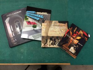
Advanced Mouldmaking and Casting, Nick Brooks, 2011
This book provides a thorough guide with case studies of mouldmaking and casting with a variety of materials. Whilst our facilities of this are limited we hope this book will guide you to approach this method with more confidence as well as see what is possible outside of a workshop environment. As with all our books you are welcome to use as reference within the workshop but please don’t take out.
This project was given to me from the University estates department who were wanting a representation of the University of Manchester’s Whitworth hall and tower that make up the Oxford road side of the old quadrangle complex. The model would then be used in a snow globe for a Digital Christmas Card sent out across the University.
As the project required the model to be waterproof I decided it would be a good opportunity to record the process of using Ureol, commonly known as Chemi-Wood or Model Board.
Whilst in this case I am using Chemi-Wood as the main material, the methods used are applicable to any kind of massing representation – this one having perhaps more detail than normally required due to its purpose.
Here is my step by step record of the process undertaken for around 5 hours over a period of a week when ever I found any time! I have included my rough sketches and thought process description to help understand how I chose to tackle the difference aspects of this representation.
Planning
The model had to be a maximum of 100mm long to allow it to fit within a snow globe. Firstly I scaled the CAD Drawings based on the required size and printed a plan and elevation to directly reference the model components as building each one. Having an accurate plan to work to is essential. Always check and double check it is printed to the correct scale.
With the printed plans as a guide I began dividing the model into components to be massed out, thinking in my head and in turn on paper about any pitches or areas that may need to be removed later.
By identifying commonly sized components, or close to the same size you can then best determine how to cut your material to avoid waste. In this case the height and width of two components happened to be the same so I started by cutting a piece at 22mm wide.
Primary Massing
Cutting a block at 22mm width gave me a thin sheet off-cut which will come in handy later. Always keep hold of thin strips like this as they prove very useful when making add on details. By putting a piece of sandpaper on a flat board we can easily sand the sawn face of a piece of material to flatten off any saw marks. With chemi-wood in particular this is very straight forward and gives a smooth clean finish. Taking the time to remove saw marks at each stage of production will save time in the long run and helps to keeps the resulting components looking crisp.
Creating a pitched roof
Accurately marking on guides when creating a pitch is recommended as without them we can only presume the machines are set accurately which, given the number of people who use our workshop, is often doubtful! Once the piece has been cut to the required length it can then be sanded down using the disc sander, in this case removing the minimal amount of material on the edge to create the pitch as marked. Blocks with larger areas to be removed should be cut down closer to the marked line before sanding to avoid burning out the sanding discs and creating excessive force on the machine. Note that I have marked the pitch at the end of the piece to ensure there is enough material to hold on to whilst sanding reducing risk of injury. Always check your marked guide lines as you go.
Once the pitch is complete the piece can be removed from the block. Smaller components that require pitches can sometime be achieved as part of a bigger block using the end of a longer strip of material as shown below. Again this was created using the disk sander and clear marking as a guide. For now this piece will remain attached until the massing detail has been added. The tower section was measured out from the plan and two-stage pitch added. This photograph shows the second pitch marked out ready to be sanded.
Massing Details
The second phase of the model is to establish what details need to be added to take the blocks to a more familiar form. As with all models a level of detail needs to be established across all components. In this case the archway and repeated buttress’s are of notable presence and so provided the basis for the other relief details as sketched below.
Using the thin sheet off-cut from the first block, I took the elevation details of the archway from the CAD drawings and created the archway port surround and turret details by layering the two. Laser cutting is great for such intricate parts but presents a problem when finishing due to the fragile nature of such thin components. Care had to be taken when sanding off burn marks so spare components can come in handy if there are any breakages. I used a medium thickness cyanoacrylate ( AKA superglue) to carefully stick the layered details together. Only small spots of glue were used and can be applied with the end of a cocktail stick or a scalpel blade.
The layered up arch facade can then be applied to the primary massing from earlier taking care to center it as marked. Once fixed the material filling the arch is removed in notches using the bandsaw – controlled easily thanks to the extension we have the piece built on with a push-stick. After hand filing the curve of the arch using a round file the piece can be parted off from the extension and excess material carefully sanded back to the marked line taken from our printed scaled plan.
STOP PRESS! MISTAKE DETECTED!Leaving the workshop and walking down past the Whitworth Hall after work I noticed an error with my model so far in that I had wrongly presumed the footprint of the tower made up the entire plan print as shown. This in fact turns out to be wrong and the tower makes up just over half of the block footprint.
No need to panic!
By reviewing the plans and evaluating the oversight It was easily rectified by modifying the piece using the top center as a reference to reduce the overall size and roof pitch line. We all make mistakes so no need to worry if this happens when your making your model – its how we handle them that matters.
What ever you do don’t ignore it – especially if it is connecting to another part of the model as there is always a knock on effect with errors that will come back to haunt you! Try to take the time to do it right even if it means starting again.
 Massing Details Continued
The next details I made were the spires at the top of the towers on the end of the Whitworth Hall. to create these I took a square section of chemi-wood from the offcuts and fixed it into the chuck of a hand drill.
Taking note of the required 6mm radius I used 120 grit sandpaper to reduce the section down to a dowel, regularly checking the size with calipers.
Once the dowel was a 6mm I marked on the low point of the spire and used a needle file to reduce it down to a point before adding a shoulder at the base. The completed spire was then removed with a junior hacksaw before being lightly sanded flat at the base.
The buttresses along each side of the Whitworth hall were made using thin strips that were layered up (shown below) on top of each other having been cut to the specified step heights. Once fixed I put this piece into the laser cutter and cut strips through the joined layers creating the buttress profiles. These were then carefully fixed in place using small amounts of cynoacrylate. Finally I simplified the corner spires that finish the tower using the CAD Files maintaining the same basic level of detail as shown on the other detail elements. These were then fixed in place before fixing the tower to the archway and Whitworth Hall sections. The model could now be painted easily due to the smooth surface finish of the components. In this case the raw material finish sufficed and it remains its clean colour.
The completed Model was then fixed into a snow globe to be used for University of Manchester marketing.
Hopefully this guide will give some useful pointers for your future models. If there’s anything you are uncertain about doing yourself always ask. – Scott
The focus of this year’s U.S.E. atelier is the city of Dortmund, Germany. I was fortunate to be able to take part in the study trip that saw the group, both 5th and 6th years, exploring and documenting the proposed site along with several post industrial sites. It was agreed early on in the trip that a masterplan model should be created for group discussions throughout the year and as a center piece for the end of year show taking place next June.
“After returning from Dortmund, U.S.E. split into site analysis teams. alongside research groups, whose work was collated into a large compendium document, we were tasked with the fabrication of a physical masterplan model of the Union Quarter.Â
A scale of 1:1250 was chosen due to material constraints, fitting the width of a 2440x1220mm MDF sheet. For an appropriate portrayal of information at this scale, we largely focused on the massing and blocking whilst acknowledging the railway lines, running at a lower level to the rest of the site and splitting the Union Quarter into three parcels. Other than this drastic level change, we chose to ignore other topographical features of the area; whilst the site features a gradual incline towards the westpark, this would be largely negligible at 1:1250 and would have added considerable time and effort to the construction process.
To demarcate the site boundary, we chose to raise the union quarter on a plinth above the main model base. To economise on time, we also chose only to build massing on this plinth; outside the site boundary, roads and buildings are indicated by engravings on a plasma cut mild steel sheet. This was left outside over a weekend to rust, acting as a material metaphor for Dortmund’s steel heritage, which is highly prominent on site.
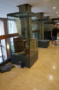
The raised Union Quarter plinths are produced from 12mm clear acrylic recycled from display cabinets at the Manchester Museum. laser cut polystyrene sheeting was plastic welded on top, forming pavements and streets, before being spray painted white. the plinths were originally constructed from cnc’d MDF, though these were scrapped as we were not satisfied with the finish or the joining with the polystyrene sheets, which did not stick well to the timber.
For the massing, we were advised by workshop staff to use chemi-wood, a resin-based material known for its ease of cutting and crisp finish. buildings were hand cut; whilst being a lengthy process, we were able to add a greater level of complexity to blocking than would normally be possible with the laser cutter, such as pitched roofs.
Blocks were then spray painted with shades of white and grey to identify their general usage, broken down into residential, public, commercial and industrial. though nearly finished to a presentation-quality standard, in future we are looking to add trees to the model as the union quarter is a particularly green urban area.”
– Daniel Kempski & Peter Lee December 2015
The main base feature of this model was the engraved 2mm thick steel sheet. On it’s arrival the steel had a light coating of oil to prevent rust which, unusually when it comes to the use of metal, was exactly the finish the group didn’t want!
There were several discussions about how to best subtly age the steel which were all trial and error with regard to retaining the engraved detail. It was decided to clean the oil from the face of the steel and leave it outside over the weekend having been lightly sprayed with Epsom salts.
At best we thought it may have started to surface rust by Monday morning. To our surprise and temporary horror the rust had completely coated the sheet in the heavy rain that had ensued. Thankfully the group were able to rub back the rust with fine grade sandpaper and the effect turned out to be better than was hoped for.
The buildings were fixed to the floor plates and the arranged in position on the steel base. Only trees remain to emphasis the green spaces across the site but have been left off for now until the final assembly closer to the end of the year. – Scott
Back in September we were invited to attend the 30th anniversary celebrations at Mecanoo’s head office in Delft, The Netherlands.
As part of the event we took the opportunity to pry into modelmaking theory and history there by speaking to long-standing Senior Modelmaker Henk Bouwer and Modelmaker Laurens Kistemaker.
The use of models is clearly a key ingredient to the design process here and will no doubt endure for another 30 years or more! We’ll be continuing our collaboration with Mecanoo in this years modelmaking award scheme. More on that soon.
Cross-section models invite us to view a subject internally by exposing construction details that present spatial and physical relationships. The process of making a model in section allows us to be explorative of the fabric elements that are applied to create the overall form in a way that complete site or massing models do not demonstrate.
By cutting through a plan we are able represent the supporting framework and foundations of a building and reveal the anatomy of their relationship to the overall form of a design. The scale of section models tends to be best suited at 1:100 or bigger due to the small size of design features at anything smaller. The smaller the scale the more simplified elements become which, when we are investigating structural or building cladding for example, becomes much less informative.
As with all model tasks we must clearly outline what it is the model is setting out to achieve.
The potential variants, materials and methods for making a model mean there is no quick answer to questions about what is right or wrong way to do something. It is up to you to identify what messages need to be conveyed and these messages will determine the approach to making the model.
Example questions to consider:
What messages must the model convey?
Is it about its relationship to an existing site or the surrounding landscape?
Is it there to demonstrate the technology being applied in the design?
Are you setting out to explain how a particular material or element of the design relates to another?
Before making any decisions think about this carefully to avoid missing the point or creating unnecessary work for yourself or group.
When looking at these models we need to focus on a specific target area of a plan that best serves our intended purpose or message. If this purpose examines how a wall will support a roof for example then ask yourself to what extent does the viewer need to see the rest of the building around this focus area?
Tips for Cross-Section Modelling
APPROPRIATE SECTION. Identify the best place to make your section on a building plan. This should be based on your overall purpose and is the most critical consideration when making a cross-section study. Try not to section areas with excessive repetition of features such as windows that will make for more work when producing the model. Double check your scale!
SUPPORT AND STRENGTH CONSIDERATIONS. Don’t rely on glue or magic to support floors or load bearing elements unless you have designed them to do so. Looking at the section in question and considering materials you intend to use you should think ahead to the point when the model should be self-supporting. How will it hold itself up if the other side of the building isn’t there? Thinking and planning the model thoroughly is crucial.
UTILISE OFF THE SHELF COMPONENTS. If your section cuts through floor levels you may need to represent supporting beams, trusses or layers of facade cladding. Rather than manufacturing these to suit make yourself aware of materials that are pre-formed such as styrene ‘I’ beams, tubing or textured sheet material. There is no point in making something that is a standardised material for construction much like how you would approach full scale building design to reduce working time and costs.
If you’re unsure of anything you know where we are.
The workshop will be closed on the morning of Wednesday 18th November due to BA programme committee meeting and first year tutorials. Apologies for any inconvenience caused. We will re-open from 14.00 as normal.
Earlier this year students from the Material Politics atelier were involved in a live social housing project in Ecuador. The project was concerned with the design and construction of social housing that was affordable and sustainable. In addition the design required a level of variability determined by location, need or individual preference. In order to convey these potential variants of construction the group designed a model kit that would allow the community to engage with the proposed construction and personally modify the arrangement of their future home through the model.
Each model kit was designed as a series of singular or pre-constructed elements made from laser cut plywood. The production of such parts requires some testing to ensure correct fit of joints as well as the issue of space within the components boxes.
The 1:50 flexible model showcases a social housing typology designed for the informal neighbourhood of Monte Sina, in Guayaquil, Ecuador. The typology proposes a construction system which can be adapted to each family’s particular needs and be constructed incrementally, rather than a set building design. As a result, the 1:50 model acts both as a device to communicate the structural principles of the typology and a co-production tool, allowing each family to design their home according to specific needs, wishes and conditions. In each model kit taken to Monte Sina, a manual is included, explaining the contents of the kit and the structural components out of which the houses are made. The neighbours were therefore able to debate their spatial needs in an illustrative manner and mock up their future houses with ease.
The group produced an accompanying assembly guide for families wanting to use the kits. This serves as a great insight for us to the design of the model and how such thorough thought can be applied and transferred to full scale construction planning. The guide can be viewed online here.
Many thanks to Eira Capelan for her summary of the project.